[0]: https://developer.mozilla.org/en-US/docs/Web/CSS/Reference/P...
I can't think of a single good reason why they don't adopt an "evergreen" 4/6-week update model except Not Invented Here syndrome or "it's not Apple-like, we prefer the OS team (and therefore Marketing) dictating our release schedule, users be damned".
It's an own-goal for no reason.
I recognise that this is a controversial take, but in my opinion what Google is doing is a variant of “embrace and extend”. Traditionally, this meant proprietary extensions (e.g. VBScript) but I think this a subtle variant with similar consequences.
The web platform doesn't need to move so fast.
The ever current adage of distortion field applies here.
Just like Safari not having webgpu was touted as a feature and now that it has support, webgpu suddenly turned into a feature. Apple can do no wrong to some. Whatever they do is a feature. And if they don't do, it's a feature too.
Implying otherwise is itself a bad argument.
It is true that Safari sometimes lagged in ways that are legitimately open to criticism. There are instances where Safari had incomplete or broken feature implementations. But many claims of “broken sites” are really just evidence of lazy developers failing to test beyond Chrome or to implement graceful fallback. Relying on bleeding-edge Chromium features before they've been broadly adopted by browsers is, IMHO, a infatuation with novelty over durability. It's also, IMHO, a callous disregard for the open web platform in favour of The Chrome Platform. Web developers are free to do whatever they like, but it's misleading to blame browsers for the bad choices and/or laziness of some web developers.
Correct. People test Chrome first and often only. That'll never change because people are lazy and you have a humongously long tail of websites with varying levels of giving a shit and no central authority that can enforce any standards. Even if another browser takes other, they'll only test that one.
The solution is formal tests and the wpt.fyi project. It gives a path to perfectly compatible implementations of agreed-upon standards, and a future where *the only* differences between browsers will be deliberate (e.g. WebMIDI). Brilliant.
That's why I wish the gap between Safari TP's wpt.fyi score and Safari stable's score was shorter. Simple!
As a web developer myself, I appreciate the frustration with Safari's flexbox bugs of a decade ago and viewport bugs more recently. I also remember being endlessly frustrated by Chrome bugs too, like maddening scroll anchoring behaviours, subpixel rounding inconsistencies, and position:fixed bugs which were broken for so long than the bugs became the de-facto standard which other browsers had to implement. All browsers have bugs. To suggest that Safari was uniquely bad is to view history with Chrome-tinted glasses.
That hasn't been true for a few years now.
Even now, when a site breaks in Safari, more often than not, it's because that particular site is using a Chrome-only feature that hasn't shipped in Safari or Firefox yet. These developers need to be reminded that progressive enhancement is a thing.
There are web developers who only test their sites on Chrome, which makes no sense, given mobile Safari has around 50% marketshare in the US [1] and about 21% globally [2].
> Just like Safari not having webgpu was touted as a feature and now that it has support, webgpu suddenly turned into a feature.
I must have missed this one, but anyone paying attention would have noticed WebGPU had been available in Safari (behind a flag) long before it became official; it was always on track to becoming a real feature.
[1]: https://gs.statcounter.com/browser-market-share/mobile/unite...
[2]: https://gs.statcounter.com/browser-market-share/mobile/world...
You shouldn't be allowed to use an old device with an updated browser, especially not a browser from a 3rd party, because that doesn't help Apple sell more iPads.
There's a new version of Safari Technology Preview [1] for macOS every two weeks.
There's a new version of Safari released every September for macOS, iOS, iPadOS, and visionOS. This has been the schedule for several years. Since Safari 26 shipped on September 15, 2025, there have been two updates for these platforms:
Safari 26.1 on November 3rd and 26.2 on December 12th.
The Safari team shipped 7 releases this year, averaging 7½ weeks between releases; not a significant difference from 4–6 weeks. Each major release of Safari for macOS runs on the current macOS version (Tahoe) and the two preceding ones—Sequoia and Sonoma.
BTW, there were 9 Safari releases in 2024, averaging 5.8 weeks apart.
It's not the first time Safari shipped a significant new feature before other browsers; :has(), Display P3 color support, JPEG-XL come to mind. At the end of the day, there's no NIH or Marketing team dictating the release schedule.
I use Safari as my default, and like every Firefox/Safari user I still get some bugs that don't occur in Chrome (not talking about WebMIDI obviously), so watching that 30 point gap between stable Safari and bleeding-edge WebKit (longer than 7½ weeks) on wpt.fyi was quite frustrating. The average Safari user would have a better browsing experience with a shorter fix delay, that's just the truth. Having to wait for macOS updates holds back the browser, unnecessarily.
Safari is an operating system component, which lots of people don't seem to understand; hundreds of thousands of 3rd party apps rely on Safari's WebKit engine.
I've never heard a normie Safari user complain that Safari updates aren't being released quickly enough; that's something web and app developers care about… which is why Safari Technical Preview is released every two weeks.
Even the release versions of Safari on iOS, iPadOS and macOS allow you to enable web features that are still in development.
Not all of us were surprised; some of us have been watching the Safari team shipping the latest HTML and CSS features for a few years now.
https://wpt.fyi/results/wasm/jsapi?label=experimental&label=...
The full test-suite of wasm tests are here:
I think they realized that shipping the features out of sync meant nobody could use them until all browsers adopted them, which took years, so now they coordinate
Hopefully they will make Safari smoother and faster with Multi Tabs in future release. There are lots of multi tab feature they could copy from Firefox.
It's good they're trying to not make Safari suck as much.
Caniuse is pointless, their new "baseline" score is pointless; as long as enough people keep using their (perfectly fine and working) iPhones after official support stops and as long as they are not allowed to install a different browser (engine), that's the only data point you need to look at when choosing which browser features to use.
One could argue Safari on iOS being like macOS where it could be updated standalone, but current rate isn't too bad.
Also the thing is that there are plenty of features supported by Safari and Firefox that Chrome is slacking on. Nobody every complains about those features though because nobody would try to use a feature not supported by Chrome in the first place
Absolutely true! I've said the same thing many times myself.
Stating that Safari is the new IE is one of the answers to:
"Tell me you didn't do web development in '90s and have no idea what you're talking about without telling me you didn't do web development in '90s and have no idea what you're talking about."
Their result is: 1974740 / 2152733 (91%)
They also have their own dashboards tracking this [2]
[1] https://wpt.fyi/results/?product=ladybird
[2] https://grafana.app.ladybird.org/public-dashboards/2365098a1...
https://wpt.fyi/results/?label=master&product=chrome&product...
To answer your question, yes. Apple requires 80% test passage of all the tests on web-platforms-test in order to be considered as a valid browser for iOS so they specifically targeted this suite to reach that milestone
It's a pretty silly requirement because wpt is not really meant to be representative of all web platform standards. It includes tests for non-standard features and the majority of tests are simple unicode glyph rendering tests.
Apple is fighting it tooth and nail and coming up with requirements for other engines is a small way of doing that.
Of course Safari pushes to have anything they don't want to support not in that subset.
I'm tired of having to use stupid hacks to get nice-looking borders between flex/grid items.
It is funny how we keep asking more and more and more even though we already have it so much better than before. Can we never be happy with what we have?
I've been developing web stuff for 15 years now and sometimes I can't believe comments like these. We didn't have it "so much better before". CSS sucked hard and getting things right for three devices was an incredible pain in the ass.
Tables have semantic meaning. They don't support fractional units. Reflowing for mobile is impossible and you need JS hacks like splitting tables. You can't reorder natively.
Flex and grid enable layouts that are far beyond anything we could do with table layouts. Anyone who claims otherwise has obviously not done any amount of serious, production FE UI design and development.
Are there bits of DX ergonomics I’d like in flex and grid? Of course. Does the syntax sometimes feel a bit arcane? Yeah. But the raw power is there, and anyone who claims the contrary is either a gormless backend developer, or some troll who is trying to design things in MS Word.
I reminded that person we had to use floats and positioning hacks and abuse HTML tables for page layout before flexbox and CSS Grid were created.
There was no way simple method to center a div!
They meant now. "we have it so much better than how it used to be."
Gap decorations allow you to add borders between flex/grid items, but without the woes of dealing with table quirks and behavior.
Common use cases would include mimicking design patterns found in print layouts, particularly newspapers and menus, to help divide groups of items or info.
Thank you to everyone who is making this happen.
Adding a new element still need dimension of the element and a bit JavaScript.(The whole page use < 100loc unobfuscated JavaScript) But resizing can be handled by css naturally.
I think the issue here is most people don't really have a good way to specify how masonry should work. And thus don't have a good implementation either.
Actually that's exactly what they do. They like the animations while some people, especially devs, do not. But they don't use it multiple times, because they would be able to see how it gets annoying after the first time.
Masonry works well if you have different aspect ratios of the same orientation.
Here is an example of the layout of a photostream that I was satisfied with.
https://frifoto.emilbratt.no/?view_mode=photo-stream&tag=All...
The defining feature of masonry is that it supports mixed aspect ratios. That's its whole thing. If you aren't mixing landscape and portrait images, you shouldn't be using masonry layout.
- If you stretch all images into a uniform aspect ratio, they get all squashed and look terrible.
- If you crop all images into a uniform aspect ratio, you lose potentially the majority of the content in some images.
- If you display all images at their natural aspect ratio and their full size, there will be huge swathes of empty space in between them because they don't pack tightly.
Masonry layouts allow you to preserve aspect ratio without wasting a massive portion of your user's screen space. It's not perfect, but it's the best layout mixed-orientation content that I know of.
If you know of a better method to handle mixed orientations, I'd love to hear it and would gladly rescind by remarks.
[1]https://safebooru.donmai.us/ (note: this is a "safe" subset of danbooru for reference, but it is still not safe for work)
Consider a similar layout to OP but the landscape images will span multiple columns as well as everything it already does.
The thing about masonry is that it adapts to the size of the images. You could already do masonry using flexbox if you know the image sizes (https://github.com/hannasm/masonflexjs). Doing it as a true mosaic layout would be a step above current capabilities. At that point it's probably pretty easy to create configurations that don't fit perfectly/ require lots of empty space to layout nicely though.
Edit: doc has this first example https://masonry.desandro.com/layout that you could use but have to imagine images to be twice the size, similar to a Müller Brockmann grid
If you try to go left-to-right, you will quickly realize that at the end of each "line" it is really difficult to know where the next line starts. It is easy to accidentally start again on the same line (and inspect the same elements), or skip one accidentally. Then navigating through the elements one by one requires a considerable amount of cognitive effort, your eyes bounce up and down constantly, and you end up inspecting the same elements multiple times.
If you try to go top-to-bottom, lane by lane, you will then realize that the page also has infinite scroll and you will never go past the first lane.
Larger images dominate and flashy images become more important to get attention (if bringing focus to an image is the idea). An extremely poor way to present information.
I can't check because my wife's iPhone is, regrettably according to her, "updated to the latest glAss version".
I do have a website with a lot of images, and at the moment everything is in a 3-across grid layout...
TLDR: in the user's eyes, a newspaper and this sort of layout are not very different, if the average user can navigate the former for hundreds of years, they can navigate the latter.
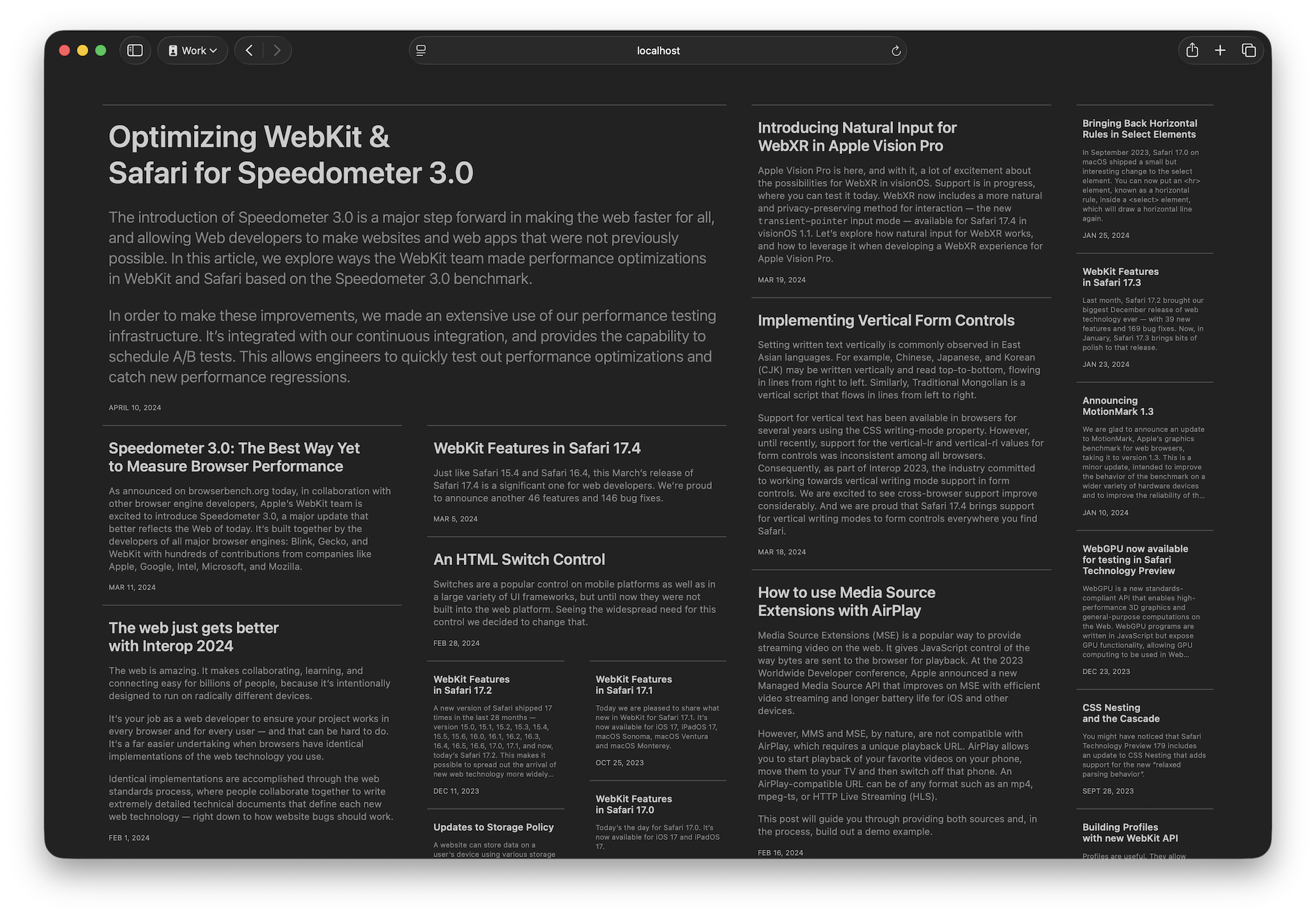
After reading the top-left block of text titled "Optimizing Webkit & Safari for Spedometer 3.0", what the fuck am I supposed to read next? Am I meant to go recursively column by column, or try to scrutinize pixels to determine which of the blocks are further up than the others, skipping haphazardly left and right across the page? A visual aid: https://imgur.com/a/0wHMmBG
Columnar layout is FUNDAMENTALLY BROKEN on media that doesn't have two fixed-size axes. Web layouts leave one axis free to expand as far as necessary to fit the content, so there is no sane algorithm for laying out arbitrary content this way. Either you end up with items ordered confusingly, or you end up having to scroll up and down repeatedly across the whole damn page, which can be arbitrarily long. Either option is terrible. Don't even get me started on how poorly this interacts with "infinite scroll".
Using such a layout for a novel or something like this would be really bad UX. But using it for an image gallery? Or a series of random articles that aren't priorized? Why not?
You can use plain old CSS columns (which don't have the automated "masonry" packing behavior of this new Grid layout, they just display content sequentially) and scroll them horizontally. But horizontal scrolling is cumbersome with most input devices, so this new "packed" columnar layout is a good way of coping with the awkwardness of vertical scrolled fixed-width lanes.
What a weird comment. You read whatever you want next, ever read a newspaper? You scan it all and pick the article you are interested in, then read that. I don't understand these comments, they work perfectly well in real life (and fixed size is arbitrary, I can make a super wide or super long newspaper too, the axis size does not affect this sort of layout, see infinite scroll for example, as there is only a fixed amount of content on the screen at any given time).
Okay. What order am I supposed to scan in so I don't lose my place and accidentally skip a block? Scanning column by column gets me cut off partial boxes that I'll have to remember to check again later, while scanning side to side forces me to keep track of each individual block I've already looked at, as opposed to a single pointer to "this is how far I've scanned". Alternatively, I can scan roughly left to right, top to bottom and just live with missing some blocks. That's not ideal either, because hopefully if you didn't think I'd like to look at all of them you wouldn't have included them on the page.
You're right that you can make a newspaper that's really inconvenient to read, but you wouldn't, because the failure case you'd end up with is CSS Grid Lanes.
So again, I will contend that this is not a problem for the average reader. I really cannot see where the difficulty you seem to say lies.
Is this really how you think people read newspapers?
grid-template-rows: masonry;
is going to be outdated then?
I think that’s an exceptionally uncharitable description of what happened. This is a decision the WebKit team has been repeatedly publicly asking people to participate in for over 18 months.
> Help us invent CSS Grid Level 3, aka “Masonry” layout
> P.S. About the name
> It’s likely masonry is not the best name for this new value. […] The CSSWG is debating this name in [this issue]. If you have ideas or preferences for a name, please join that discussion.
— https://webkit.org/blog/15269/help-us-invent-masonry-layouts...
> Help us choose the final syntax for Masonry in CSS
> We also believe that the value masonry should be renamed.
> As described in our previous article, “masonry” is not an ideal name, since it represents a metaphor, and not a direct description of its purpose. It’s also not a universally used name for this kind of layout. Many developers call it “waterfall layout” instead, which is also a metaphor.
> Many of you have made suggestions for a better name. Two have stood out, collapse and pack as in — grid-template-rows: collapse or grid-template-rows: pack. Which do you like better? Or do you have another suggestion? Comment on [this issue] specifically about a new value name (for the Just Use grid option).
— https://webkit.org/blog/16026/css-masonry-syntax/#footnote-1
> [css-grid-3] Renaming masonry keyword
Surely they can’t start just pinging everyone who might have cared at some point during the time to get involved.
It got to the point where I believed that subgrid was dead. FF implemented it but absolutely no one else did, for years.
Is it our fault for tuning out of the debate? Yep. But tactics were employed to achieve that exact outcome. I'm fine admitting that I tuned out. But it was a battle of attrition waged by people who were fine holding up progress indefinitely.
Is that how you want decisions to be made?
Ultimately I'm not too concerned what you call the masonry feature. However the debate over what to call it was an extreme case of bikeshedding. I would have rather given up the fight over semantics to resolve the non-issues and ship the feature years ago. As it stands we're still years away from actually being able to use the feature in production.
I've stopped waiting for companies, committees, or projects to change course. I don't have an incentive to build consensus within a group of people who fundamentally disagree that the thing I need should exist. Why bother? I have an incentive to spend my time building features that users will use.
There’s no incentive to the companies or the employees to draw out the discussion, especially over something so trivial. It’s much more preferable to try and speed through things to get things done in a time frame that can be adopted.
And regardless, if you don’t feel it’s worth your time, then why cast aspersions that it was something clandestine and intentionally hidden? You could have shown up and kept up with it, just like everyone else involved presumably did.
I didn’t ascribe a motive to anyone. Their reasons are their own and it only makes sense that the people who stay in these fights do it because it’s part of their jobs.
There are people who, for whatever reason, keep debates going over small points of disagreement and prevent issues from being settled. Sometimes for years. Right?
The older I get, the more likely I am to recognize and route around or ignore interminable debates. Especially if it’s not for a company, project, or initiative under my direct control.
Remember, the question at the top of this thread was essentially “What happened to ‘masonry’?” Well, there were quibbles over the descriptors.
I don’t care about quibbles. “masonry”, “grid-lanes”, “grid-masonry”, pick one, they’re equivalent. I don’t like it when quibbles block progress.
Sometimes people and companies do want to block things. You’d have to ask them why. Like I said earlier:
> I don't have an incentive to build consensus within a group of people who fundamentally disagree that the thing I need should exist.
Pick your battles… Actually, no, it’s usually better to ignore the fights and just get what you need to get done so you can move on.
It sucks whenever browsers backtrack on a W3C standard that reached "Working Draft" status but it doesn't seem like it's gonna impact many people
Besides, it's not being "deprecated". It will continue to work as it does. We just have a better alternative that the big 3 all agreed on.
Masonry or grid-lanes, who cares? I’m just glad masonry (the feature, Baseline 20XX) and subgrid (Baseline 2023) are finally here.
This will of course slightly crop all your images to make it fit, but in practice as long as you keep your image aspect ratios reasonable and the images small enough on the page it's really quite subtle.
I had hoped that this feature would provide for masonry like that, but one has to make do.
    .masonry {
      display: grid;
      display: grid-lanes;
      grid-template-columns: repeat(auto-fill, minmax(180px, 1fr));
      grid-template-rows: masonry;
    }
Browsers supporting the new syntax will override the `display: grid` with `display: grid-lanes` and ignore the `grid-template-rows: masonry` syntax.