Posted by robenkleene 3 days ago
I am not saying that it's a good idea to have different corner radius, just that it's nothing new.
Did they explain the reasoning?
I feel like this is the design process. You have ideas, they sound ok, you try them out, and then immediately you revert a lot of them. The ideas without the taste to know when not to do something is becoming the new Apple way
When the top right corner contains a search field instead of rounded button, that also seems to use varying curvature instead of capsule with proper circles at the ends. Still results in varying spacing between window corner and the toolbar content.
And that's just the 2 top corners. Attempts to align top corners result in even bigger mismatch with the rest of the window content. For example calculator -> it has a grid of round buttons. While the window corners might match top bar (as good as they can due to different shapes) the main calculation buttons don't match the corners at all.
Similar problem affects many of the popups which have something like confirmation button anchored to bottom right corner.
Rounded scrollbar handle - not aligned with bottom left corner size, instead it awkwardly gets cut of by different amount in each program.
Menus also have this disease. The non circular corner curve of overall menu shape extends way past the corner of item highlight resulting in varying spacing and making it feel almost like whole menu has bulged out instead of flat sides.
And to OC you're replying to: window close/minimise/resize were already equidistant from window edge on macOS 15 and probably earlier.
Here is a screenshot (safari in the background, textedit in front): https://pasteboard.co/OeMBTDKGsTx9.png
In MacOS 26 it's only weirder, because as you say - due to squircle window corners, now we have this constantly varying distance to the edge.
EDIT: I "get" apple's fascination to squircle, but why they made it such a big radius. Probably no one would've complained if they just have changed from current ~15-20px rounded corners into ~15-20px squircles, but they went 50px+ on toolbared windows.
Also, it’s almost as if you can’t imagine that other users might have needs and preferences different from yours.
I just did an image search for "classic macos" and one of the first hits was from https://www.versionmuseum.com/history-of/classic-mac-os. Look at those System 1 screenshots, from 42(!) years ago -- round corners on Puzzle and Calculator, square corners on Note Pad and Control Panel! No consistency at all, isn't it infuriating?
Some cool details here: https://en.wikipedia.org/wiki/Desk_accessory
Like Tahoe, it was deliberate and there's an explanation for the difference.
But I do wonder if people at the time felt the same way.
I particularly like this Bill Atkinson tidbit at the end:
Bill Atkinson complained to me that it was a mistake to allow users to specify their own desktop patterns, because it was harder to make a nice one than it looked, and led directly to ugly desktops. [...] So he made MacPaint allocate a window that was the size of the screen when it started up, and filled it with the standard 50% gray pattern, making his own desktop covering up the real one, thus protecting the poor users from their rash esthetic blunders, at least within the friendly confines of MacPaint.
(He was totally right, making your own desktop patterns was fun but the standard checkerbard was far and away the best choice.)
Article author here. I think the quoted claim is somewhat misleading. There are at least two different ways to interpret a UI feature as "not new":
1) The feature has been in the operating system all along.
2) Something analogous existed 40 years ago and then disappeared long ago.
You're referring to 2, not 1.
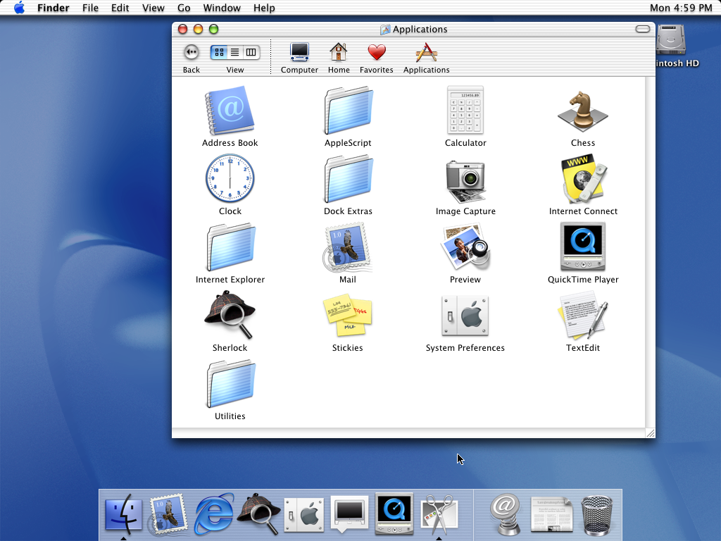
The only reason I chose Calculator app for my screenshot is that its window is very small, which allowed me to make a small screenshot, because people may be reading the blog post on small phone screens. In other ways, admittedly, Calculator is not a great example, because its window is not actually resizable, and thus it's not the type of window that you would normally place in the corners of your screen, like a resizable document window.
Rounded corners on a "widget" type of app are not as objectionable. As other commenters have noted, the calculator in "classic" Mac was a special Desk Accessory. In contrast, on Tahoe, the varying corner radii affect ordinary document-based apps.
Consider Mac OS X 10.0 Cheetah. The top of the windows had rounded corners, but the bottom did not! https://512pixels.net/wp-content/uploads/2018/08/10-0-Cheeta...
TextEdit, for example, did not start to have rounded bottom corners until Mac OS X 10.7 Lion, which was itself much maligned for bringing the iPhone UI to Mac.
https://developer.apple.com/videos/play/wwdc2025/310/?time=4...
> Each element is designed with a curvature that sits neatly within the corner radius of its container, in this case the window itself. And this relationship goes both ways. In the new design system, windows now have a softer, more generous corner radius, which varies based on the style of window. Windows with toolbars now use a larger radius, which is designed to wrap concentrically around the glass toolbar elements, scaling to match the size of the toolbar. Titlebar-only windows retain a smaller corner radius, wrapping compactly around the window controls. These larger corners provide a softer feel and elegant concentricity to the window but they can also clip content that sits close to the edge of the window.
(EDIT - and Gemini could create a plausible explanation post-hoc each time)
If you made it this far, know I am totally messing with you. It really is unnerving.