Posted by zdw 2 days ago
The formatting bar was an (IMO unnecessary) option added in iWork 08.
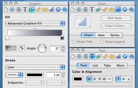
With iWork 2016, they took the existing inspector panel setup and docked it into each window.
Now the visibility of the liquid glass stuff, that is definitely a problem. Can't recognize a UI element if it's constantly rendered differently and with very little contrast with the background elements.
Well, I guess someone is going to vibecode a decent Linux GUI or fix the driver pains there or something and we'll be free of this. Because Microsoft/Apple and to a lesser extent Google have jumped the shark with their UI these days.
The sidebar for formatting they added is strictly worse than the inspector UI in old Pages ’09. The sidebar is constrained not to overlap with content, but the user can choose to overlap the inspector. It’s strictly better flexibility for users. If you are doing a lot of fine adjustments to a single text box, then of course it’s fewer mouse movement if the inspector is located right next to the text box, despite that it has obscured other irrelevant text boxes. I dearly miss Pages ’09.
Pretty sad state of affairs. Software isn’t build for usability but purely for whatever designers find fashionable at the time.
In the example, we have a sidebar for the formatting in the newer example vs havign that in the toolbar in Lion. Was it that back then, people were more likely to configure fonts & formatting settings, and we've gradually as a society de-emphasized our formatting in word processing? Or did UI changes such as this, hiding formatting options push us towards a world where we care less about formatting? I'd like to think it's a bit of both; as the user-based broadened, you had less percentage-based people that cared so heavily about formatting, so UI changes were made to optimize for that, further pushing people in that direction.
On a different note, I want to call out just how badly the sidebar is laid out compared to the toolbar. In the Lion toolbar, there were unlabeled sections but it was pretty clear what the purpose of each group was. Then you have the sidebar, where labels are added in some places, excessive space given where uneccesary, tabs that are sectioned off from the settings they'll show/hide, collapsible sections that can also be shown/hidden, some dropdowns using up/down caret while others just use the down caret, most dropdown carets being right-aligned but not the gear one, and in the liquid glass versions, the overlay of toolbar buttons over the sidebar creating confusion.
I really REALLY love the Lion icons. Colorful but subdued with only mild saturation, distinctive shapes, strong line borders with very slight halo, and mild gradients to make them pop.
I can guarantee you they have done no such research. This redesign is a clear top-down imposition to make the visual language uniform and match some lead designer’s specs, not to actually make anything more useful or usable.
Arguing aesthetics is pretty pointless (it’s a decided question to me: my taste is great; most others have very poor taste).
What bothers me about Tahoe are all the sloppy bits, like things you can no longer click or scroll to. We’re on 26.3.1 now and it looks/works like 1.0.
What really matters is not how the screenshots look, but how easy it is to use the software in action, with low error rate and without having to spend more than a fraction of a second finding the controls you need.
Anyway, we know people read symbols by shape/lines/pattern just fine without color because that's how reading works.
> What really matters is not how the screenshots look, but how easy it is to use the software in action, with low error rate and without having to spend more than a fraction of a second finding the controls you need.
Indeed. Which is why this article is mostly blowing wind.
I'm still on macOS Sonoma 14 and iOS 18