[2x5-HP-Z24n-G2] https://i.imgur.com/yLyrpfg.jpeg
[1x5-HP-Z24n-G2] https://i.imgur.com/Z7kH005.jpeg
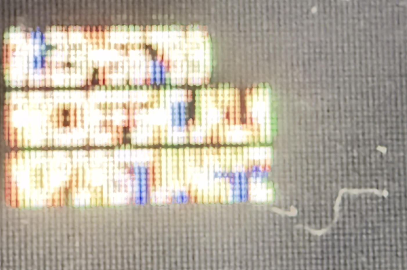
[2x5-Innolux-N156HCA-GA3] https://i.imgur.com/F4Ypxwj.jpeg
[1x5-Innolux-N156HCA-GA3] https://i.imgur.com/etkot5o.jpeg
[1] https://jp.ext.hp.com/monitors/business/z_z24n_g2/
[2] https://www.panelook.com/N156HCA-GA3__15.6__overview_33518.h...
Replace "imgur.com" in the links with "rimgo.bcow.xyz" and consider voting against the parties of surveillance next time you can :)
https://www.amazon.com/Best-Sellers-Kids'-Microscopes/zgbs/t...
Magnification is around 5x, but this is more than enough to see subpixels.
And if the pixel font images were to be rendered at actually 5 pixels on my Retina screen, because the resolution of Retina screen is so tiny, the pixel fonts would still be unreadable without a microscope.
So while it's a cool project, as long as we can put Retina-dense screens in things, we are past the point where there is any useful need for a 5 pixel font
Electronic devices
Fine prints in images
> At this size, there's no way to have a distinct upper and lowercase [...]
3x4 is feasible. I've designed the MiniGent font [1], including greek letters, numerals, punctuation, math, currency, and emojis. Written a whole LaTeX typesetter [2] around it. While not perfect, I'm amazed by how far you can take it arranging just a few pixels.
[1] https://gurki.github.io/pixeltex/minigent/ [2] https://gurki.github.io/pixeltex/pixeltex/
I'm quite fond of Spleen:
https://github.com/fcambus/spleen
It has a 5x8 font which has all of ASCII, but most glyphs are actually 4x8 and include horizontal spacing. I modified it to reduce the rest for a project I'm doing so all glyphs are 4x8. The result can be rendered on a 5x9 grid with a guaranteed line of horizontal and vertical spacing between all glyphs. It's very nice.
The hardware solution was to buy an "80 column card" that gave 80 columns of proper text, if your monitor could handle it.
In the end, I found "Gremlin-3x6" font[0] made by the guy named zephram. It's 1 pixel taller, but still a very compact when laid out horizontally. But, most importantly, all standard latin characters are pretty distinct from each other and it remains readable without zooming in too much.
Unfortunately, since then, zephram deleted his fontstruct account and all of his fonts. I have a copy of this font in my mod repo[1] along with a CC0 license and you can see the actual rendering of the font in the project screenshots[2].
[0] - https://fontstruct.com/fontstructions/show/1488093
[1] - https://codeberg.org/janAkali/isaac-extended-icons-mod/src/b...
[2] - https://codeberg.org/janAkali/isaac-extended-icons-mod/media...
for [0]
https://chinese.stackexchange.com/questions/16669/lowest-pix...
However, 5x5 isn't enough to draw "e" properly if you also want lowercase letters to have less height than uppercase, so you need at least 6 vertical pixels. And then that isn't enough to draw any character with a descender properly, so you need at least 7 vertical pixels (technically you should have 8 in order to allow "g" and "y" to have a distinct horizontal descender while still sitting on the baseline, but this is probably an acceptable compromise). And remember that in practice this means you will still need at least 8x6 pixels to draw each character, to allow for a visible gap between letters below and beside them.
It can be enough if you "cheat" and make use of the horizontal space. This is how I did it in my font:
   ##
  # #
  ##  #
###I think that's the least of the properties I'd be willing to sacrifice to have a font that tiny.
(but yeah, it's not quite right, and is especially jarring in the nice, clean, blown up pixels in the top example)
Example: https://imgur.com/a/text-80-characters-per-line-240-pixels-w...
That's 3 horizontal pixels per character on average, including inter-character spacing.
     x
    xxx
     x
xx x
xxx
x
x
    xx
     x
     x
     x
xxI could almost fit an entire 80x40 terminal on my watch face!