Posted by ckardaris 13 hours ago
1. Democracy is about access; make sure everyone has access to your software. 2. The keyboard allows folks with disabilities and power users to fly through your website/app… that being said… the second a tab is off, the person with a disability flies into a wall.
accessibility work isn't just about making things possible for folks with disabilities, it's about making things better for everyone.
Which like, we're all eventually gonna be odd folk! That's what age does to us. But we should understand these accommodations as being a net positive, not a cost, to society.
- accessibility is just usability. all it is is making sure your product is as usable by as many people as possible.
- it's a myth that "people with disabilities" are some other that excludes you, and 'accessibility' or assistive technologies only benefits other people. Everyone is only temporarily 'abled'. You need to use prescription glasses to comfortable read a computer screen? You're a parent trying to watch some TV while getting your child to sleep? All benefit from assistive technologies.
Not always. There are things that increase usability for fully abled people but decrease it for disabled people. Color-coding is a common one. Another is using smaller font size to make more info visible at once, or advanced touch gestures that can be accidentally triggered by shaky hands.
Then there are accessibility features that actively harm fully abled users, like sticky keys or screen readers that automatically follow focused UI elements.
I'm someone who enjoys this kind of work, especially when the target is a stylized drop down - I got to spend a week with the MDN page for the ARIA combobox open, trudging through all of the ins and outs of keyboard accessibility and I know I'm still missing a couple things (typing when the control is focused but not open, for example), and having clearly defined specs is something we don't seem to get a lot in webdev
The idea that it must be more accessible because it’s confined to a mono space typeface and communicates state mostly by changing the foreground and background color of the text it renders makes no sense to me.
That's not why. It's because TUI apps have to be designed around the strong possibility that a mouse isn't even available.
Also in a TUI you never ever have that issue that some text isn't copy/pastable like some dialogue boxes, in which case the screen reader might have issues picking it up too.
And in a TUI you don't have to deal with that window management crap. Moving stuff around because something else is on top. Everything happens within that little square.
It is a business opportunity as well. I worked at a company that paid for an audit before LLMs. There is tremendous cost savings possible here.
I also wonder if WebMCP will be the ultimate final incarnation of this.
Do you know one of the most underemployed groups are disabled people? And do you know where a number of disabled people get employment? Disability audits (unsurprisingly they're extremely good at this).
Congratulations on recommending further marginalising an extremely marginalised group.
But I'm not really a consequentialist and think of things in virtue ethics terms. And using technology to scale benefits to a wider group of people doesn't conflict for me. YMMV.
The law is a forcing function here. Lawsuits can and do happen when sites of a certain size fail to implement government-mandated laws. This is a good thing, IMO, but it only comes into force in the largest cases.
If there is a credible path to 1/10th the cost (while still providing liability insurance which is a critical piece) then that will likely encourage more enterprise to do it proactively, and will open the door for startups and mid-sized companies.
I have no idea why anyone would choose to see this as bad.
Sorry if that assertion stands opposed to your value prop.
No need to apologize, neither of us can predict the future. I am optimistic Fable-level models can succeed where the old not-actually-AI models failed. No shame in being pessimistic about the same.
There is so much to learn in this space.
There are small things, like dropping a 'jump to main content anchor' before the navigation so you don't have to tab through the top navigation everytime.
But there are also certain pages en layouts which require a lot of thought on a good keyboard navigation flow. Combine that with the need for responsive layouts, our inexperience with accessibility tools, etc; and the required effort quickly adds up.
I ended up stuck on my back, bed-bound in 2005, with a keyboard on my thighs. Using OSX (probably Tiger) and mostly native apps it was possible to get by with just the keyboard. It was the only platform that I could use without a pointer and I was hardly pushing boundaries.
These days just doing simple things like setting up a computer for the first time, I often can't be arsed with a mouse, or I am in places where there isn't room to use a mouse. I have to resort sometimes to a trackball out of necessity, but it's always a hassle and I frequently hit brick walls. Simple file managers can be nightmare enough. I remember just trying to navigate to a taskbar on some desktops being impossible. I couldn't get to something like the network manager applet. Thankfully there's a CLI for that now.
On the flip side, I also love the idea that you can do most things with a simple pointer.
I was trying Batocera linux recently on a laptop, the touchpad wasn't recognised, it's a gamepad driven OS (I think a layer on retro-arch), and navigating with a gamepad (once you RTM and figure it out) is actually quite nice. Kodi, has always been a bit of a faff on the keyboard, and that works well with the gamepad. Kodi was born on the Xbox so this of course should be a given. The UI for me with a keyboard has always been a bit clumsy.
For accessibility (the topic of this subthread), TUIs are not like GUIs.
I was fired because I did too much once
Can you explain what you mean by this phrase?
A common way this can fail is if the Tab key traverses through the UI elements in an unexpected order.
So just echoing that this is not just an accessibility thing, but just a good user interface design thing. If your UX designer isn't taking keyboards into account (jettison mobile first development into the sun please) then they have no business building business applications.
We would have been murdered by at least the point of sale people otherwise :)
Power users would complain within hours
No, not really. I know what you are trying to say, and I fully agree. We need to stop using "democracy" or "democratizing".
Democracy, in it's purest form, is about mob rule --majority rule, if you want to say it in a softer/kinder way. "Democratizing" means giving a mob control of the thing, it does not mean making it accessible to all at all.
"Democratization" in a sense is about making things accessible for discussions. "Dictatorship" is the opposing term - things get "dictated" by a single entity - person, political force or a corporation.
No my friend, Democracy is majority rule, which easily turns into a ruling mob. It has nothing whatsoever to do with dialog.
Also, your quote of Lincoln's address is taken completely out of context. He was talking about his opposition of the ideas of a faction of Democrats who were in favor of slavery and his support of the majority of Republicans who believed slavery was a moral, social, and political evil.
In other words, take the time to at least do some research before you try to use quotes in support of a failed conclusion.
Did you read the Greeks in school? Probably not. I recommend Plato's Republic. Both he and Socrates talked about the flaws of direct/pure democracy that would usually make it degenerate into mob rule.
In Republic Plato developed a hierarchy:
  Aristocracy: Rule by the wise (my comment: a fantasy)
  Timocracy: Rule by the honorable (my comment: another fantasy)
  Oligarchy: Rule by the rich (my comment: a reality in many societies)
  Democracy: Rule by the masses (my comment: glad we don't have this)
  Tyranny: Rule by a despot (my comment: plenty of examples of this in history)
So, "democratizing" means letting the masses have their way. It does not mean making things accessible to everyone, which is the hilariously or tragically ignorant way in which Silicon Valley tries to use the term. You see startups all the time say "we are democratizing <X>". Just how stupid are these people? They are saying we are going to let the mob have access and benefit from <X> not making it available to everyone.
In the context of Plato’s political philosophy the modern, casual use of the word "democratizing" completely ignores the historical and philosophical baggage of the root word democracy.
The irony is that modern society uses "democratize" as an undisputed positive term (meaning liberation and fairness), while the very philosophers who birthed western political thought used "democracy" as a warning label for instability and lawlessness.
A better term for what startups want to say would be "commoditizing": turning a specialized, elite resource into a public good or a widely available commodity; not "democratizing", which is an ignorant use of a term that means almost exactly the opposite.
I guess classical education has not been a part of schooling for quite some time. As a kid I did not necessarily enjoy reading the Great Books. As an adult, I can see how much damage has been caused by the abandonment of such valuable teachings.
As much as i do agree, overtime language does eventually change but it can happen over our dead bodies
Exactly, words do not carry their root's connotations as a permanent tax. 'idiot' used to mean "a layman, someone not holding office or lacking skill', or "a person not interested in politics"; 'nice' comes from Latin 'nescius', which meant "ignorant"; 'cretin' meant "Christian".
Democracy is not mob rule, and the Greeks agreed. They had a separate word for mob rule: 'ochlocracy'. Having two words means the Greeks did not treat them as identical. Plato and Aristotle argued democracy tends toward it, but they still have not treated it for a definition.
Bringing Plato here is kind of weird: The Republic is an anti-democratic aristocrat's argument, written by a man whose teacher was executed by an Athenian jury. Plato was born into the Athenian elite. His mother's family gave Athens tyrants whose regime killed something like 2000 citizens in less than a year. Plato initially was invited to join, he considered it, and pulled back when he saw what they did. He was part of anti-democratic coup. Citing him here for the word definition, is like citing Marx for the only definition of 'capitalism' - not exactly inaccurate, and might be even exactly correct, yet the context and connotation still matters - Plato took neutral-to-positive word and gave it a hostile reading, while Marx haven't even talked about 'capitalism' (he had "kapitalistische produktionsweise"), the actual term as we know it was popularized later.
'democracy' aside, "make accessible to all" is a long-established dictionary sense of 'democratize', it was never a Silicon Valley invention. And you're right - "representative democracy" only took hold in the late 1700s. The term's meaning moved after Plato. If democracy could shift from Plato's warning label to a thing Hamilton endorsed, 'democratize' could shift too.
I implore you, good sire (@robomartin), to unsaddle your high horse and let the language take its course - if people and times decide to give words different meaning, it most likely will happen anyway.
... And then your app turns into a canvas made in Electron.
It is an absolute train-wreck trying to get everything to work and for the overwhelming majority of products it isnt work the effort. It isnt like you put a wheelchair ramp up and are done. It is a constant battle with every change.
It is just another one of those things where the minuet minority suffers. Now if a company got some tax write off for it, that would change things.
Part of the blame lands on the shoulders of popular UI frameworks (or in the case of those choosing to eschew use of such, the developers who made that choice). The older frameworks tend to make this fairly easy; for example, in Cocoa/AppKit (Mac native UI framework), one can pretty easily wire up their entire UI for proper keyboard navigation entirely visually (mostly just consists of connecting nextKeyView outlet between controls to produce a logical chain to tab-focus through). Defining key shortcuts is also simple; add a menu item for a command and set its corresponding shortcut (which in turn allows the user to rebind the shortcut in System Settings at will).
That sort of design has fallen out of favor with newer frameworks, unfortunately. The new preferred style seems to be a wireframe that the dev chooses which parts fill in, and often only the barest of essentials makes the cut.
On the app level, keyboard navigability depends on the developer. If they take the time to dot their I's and cross their T's it's between decent and great, but if they don't care it'll be bad.
It’s in the accessibility settings.
https://support.apple.com/en-za/guide/mac-help/mchlc06d1059/...
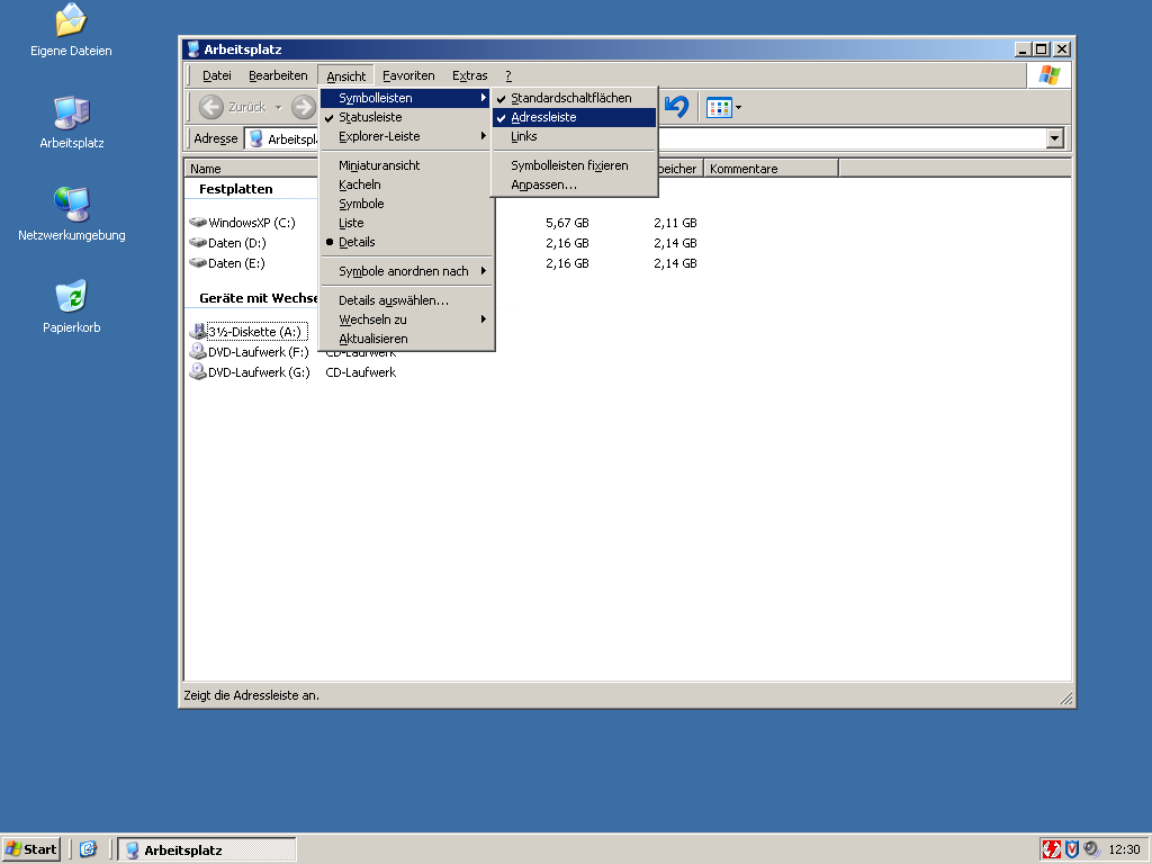
There's no option to bring up a context menu with the keyboard. And there are no keyboard accelerators _AT_ _ALL_. Windows will underline the shortcut characters when you hold "alt".
I quote from Apple https://developer.apple.com/design/human-interface-guideline...:
> Always make context menu items available in the main interface, too. […] In macOS, an app’s menu bar menus list all the app’s commands, including those in various context menus.
Therefore one can rightly conclude that there is no need for a key to bring up a context menu.
This reminds me of frequent conversations with other developers when presented with a bug report. "That's not a bug, it's working as intended." The intention is wrong, then -- the bug is in the design, not the code, but it's still a bug.
That used to be the case but has changed. Since at least macOS 15 the context menu key on typical keyboards is recognized and functions, and on other keyboards it can be opened with Ctrl+Return.
Apple's adding it to its own keyboards as well, at least on the third-generation Magic Keyboard with number pad (between F13 and forward delete).
Microsoft took accessibility of Windows and apps as a basic requirement. The fact that Windows is the daily driver desktop for the staff of the regulatory agencies that would bring complaints would not have gone unnoticed.
But really, why wouldn't you? You almost get it for free if you use the standard widgets, and smooth keyboard navigation is far faster for experienced users than having to repeatedly move one's hand between keyboard and mouse.
Bing, Bing, Bing! I came here to vent how the new windows 10 and windows 11 interfaces (made by Mac enthusiasts, ughh) have omitted keyboard accessibility for a cleaner look. They also dropped drag and drop support (which I never knew about in windows 7) and I completely missed how useful it could be on Windows 10/11.
This is even more visible when using Apple’s own apps on macOS. Choose any of them that have been ported from iOS without any attention to detail or any QA for accessibility, like Reminders or Settings or Notes or another app. The tab key will not take you where you might expect. There is no way to navigate only using common keyboard shortcuts. Nobody working on all these Apple apps have heard of tab order or keyboard based navigation.
Which ones, besides web frameworks pretending to be desktop ones? Most if not all frameworks I know support keyboard navigation.
Sadly, macos keyboard navigation is dwindling in interactions like the screen sharing pop up when you plug in a monitor
HN's insistence on acting like all users are Arch Linux efficiency perfectionist hacker types is painfully corny.
(This reads harsher than I intended. Sorry about that. I love Arch Linux people. It's just think it's no less noble to serve the average Joe than to create the perfect tool for power users.)
Keyboard shortcuts should be an _optional_ way to interact for accessibility and power users! They should never be required!
This is what TUIs get wrong, they make it the required way to navigate and often don’t even let you use the mouse.
Commercial software is THE power user use case. Your users will be using your software 8 hours a day, 5 days a week, for years. And still, the software is obtuse point-and-click garbage. Meanwhile commercial software from 25 years ago could be navigated at light speed.
That's part of the reason Excel can't be dethroned. Excel is from the old age of software, and that means that users can input and navigate at light speed. All these fancy tools claim to dethrone Excel, but when you actually use them you realize it's a goo goo ga ga Fisher Price level UI. Extreme amounts of whitespace, buttons hidden behind submenus of submenus (which you have to navigate by eye, by the way!), features stripped, UI constantly shuffling around between updates.
Look, that works fine for a website on the open web where you assume your users have never touched a computer before. That does not work for commercial software.
if anything, excel exceeds in being MOUSE-driven - it's intuitive in what you press and what you drag
and that's kinda my problem with the TFA - author is not representative of typical user. Mouse interaction is the king
Devs consistently underestimate how many power users of Excel there are, and often don't understand how they operate.
and then 365 came along ... an option to pull stock market data here, a LinkedIn connection there, oh look a wild copilot button appeared.
This way it becomes easy to memorize key sequences; start by navigating with arrow keys, then eventually speed up as you memorize each menu item's mnemonic key, and if you ever forget, just look at the menu.
It was the keyboard-friendliest idea ever, without requiring any sort of terminal. I'd even say friendlier than MacOS (heresy!!) or, yes, VIM (burn the witch!!!)
So even if the developer forgot to configure mnemonics, which was as easy as prefixing a letter with ampersand, you could navigate by keyboard. Sometimes tedious but beats not being able.
> I'd even say friendlier than MacOS (heresy!!)
Honestly, I disagree. If you've used macOS for a length of time, you might be aware of the universal menu search system using (cmd+? i.e. cmd+shift+/). Hit that, type the menu item name, and simply hit return to activate it. Doesn't get simpler than that. The alt+ system always feels very janky to me on Windows because on many apps, hitting Alt relayouts the entire app sometimes to show the menu bar on top.
And trying to satisfy every audience at once is a good way to satisfy none. You don't want your app to be a Jack of all trades; focus is really valuable.
I think this is a bad reason. Even MS Office has made this work. But I've seen people act on this type of argument. If nothing else, it should be possible to have a settings menu where you can define your own. Even if no shortcuts are set by default and they aren't shown anywhere else in the UI, it will still be possible for a power user to make the best use of the program.
Underlining the accelerator key is subtle and shouldn't be overwelming. Keyboard navigation unaware users probably won't even notice.
> This works poorly if you intend to localise your application. Great if you don't though.
Sure that's true. But remember M$ allowed you to fairly easily edit those underlined-characters in, oh, for example Office 2002 and 2003. Even if you didn't have a lot of default underlines in your current language settings, it is still possible for someone to add their own underline-shortcuts.
Back in those days, the first thing I did on any personal new install of Outlook, was to disable the shortcut that marked all email as being read. (That's cause I hit that button by accident too many times.)
That's a feature that was hidden from me at least, but honestly, this is a good-ish solution to that problem.
I remember Office having the underlines, but they were inconsistent between the original English and my localised version (and I used both depending on the machine), which made them useless. That wasn't that big of an issue when all the normal keyboard shortcuts are also written out, but it would have been even less of a problem if I knew how to edit them.
Even for keys that aren't mnemonic, do you want undo to be ctrl + z or ctrl + the key closest to left shift?
Hence my original comment. I haven't had a problem with different keyboard layouts, since most of the keys that change are on the outer edge, nowhere near where the most common shortcuts are located (then again, I rarely type using QWERTZ).
> Even for keys that aren't mnemonic, do you want undo to be ctrl + z or ctrl + the key closest to left shift?
CTRL+Z, since that's what it's been since time immemorial, even on ISO keyboards. Consistency is king.
To be fair to your point though, that's what most localisation of programs are these days.
Every application did it for decades after the first Xerox guidelines up until Microsoft and Apple decided to retire the concept of usability some time around 2010.
That is not a requirement, having access to menus, a master help shortcut ir fuzzy search actions shorcut are other options.
My wife is a UX Design consultant and she had an engagement where a bunch of state government accountants were bemoaning how a redesigned procurement platform took away all their keyboard shortcuts.
Majority of computer professionals (programmers included) come to appreciate a single fundamental truth about their field way too late into their careers. That the most basic foundational unit, the substrate they need to conquer is text. Everything stems from it. We have to deal with text our entire lives. It doesn't matter where that text appears - in web browsers, in Jira, in Slack, in terminal, in PDFs, Word or LaTeX documents. Code by the way is just structured text. The feeling of empowerment and liberation when you can deal with text on your own terms is a disproportionate multiplier. That's why using multiple cursors feature for the first time feels so amazing, even though the practical cases for it are not that common.
And when I say "text", I don't only describe the process of "grabbing some text" and "piping it" into another process, or manipulating it. It's not only about the input, the act of consuming text is equally, if not more important.
We argue that keyboard-driven UIs are more efficient for the input, but hundreds of memorized shortcuts can't really fix the fundamental problem.
Vendors are designed to own you and ownership can take different forms. Slack app that doesn't let you easily extract code snippets from a thread - owns you. Jira that forces you to use their stupid, quirky wysiwyg editor - owns you. Note-taking app that keeps the data on the cloud ain't your friend. The friction is the ownership. When extraction of text requires effort, the tool has leverage over you. It's a subtler form than data lock-in, it is behavioral lock-in. You adapt your workflow to what the tool makes easy, and gradually the tool's affordances shape what you even think to do. Information gets buried in threads, search is mediocre, export is hostile. The "solution" they offer is to stay there longer - search in Slack, link to Slack, screenshare in Slack, summarize with AI in Slack, don't ever leave Slack. The tool becomes the answer to the problems the tool creates.
And when you get to that point, you'd feel helpless - all your knowledge and muscle memory can't help you there - not only the app is not favoring power-user experience, it's forcing everyone downgrade to the "average Joe" levels.
Most popular editors and IDEs don't give you direct leverage over plain text either, at least not without the effort from your side. Shortcuts, popups, UI elements in the IDE at best are local drivers - you can't easily grab a thing from the outside and feed it to your LLM context in the middle of a task, or insert within a comment in the code - you have to switch, copy, paste, deal with format inconsistencies, manual conversion, etc. Then we keep bargaining what method is the best, fastest and most convenient - using the mouse or keeping the fingers on the home row, modality or complex shortcuts. All for the sake of the problem that's artificially enforced on our workflows.
Terminal-heavy users eventually start appreciating the leverage Unix philosophy grants them over text, but that's still contained within locality, they still have to constantly jump around, while eventually figuring out ways for automating some aspects of it.
Point is - do not give in to the status quo. Liberate your text - deal with it on your terms. Get annoyed whenever you need to switch back and forth just for the sake of finding the piece you need and moving it around - it should be instantaneous and instinctual. Like a boxer moving in a ring and casually throwing heavy punches. Long-time Vim and Emacs users "get it", even though they often don't follow through - some things just never become gratifying instincts. Sometimes, even the opposite forms - like redundant muscle memories. Some outright would reject using a new app because it messes with one shortcut they keep accidentally pressing. Sometimes, I wish there was an agreed standard for every UI - to have only the core, commonly used keys pre-set, while making everything else configurable.
Push a button, every icon is now labeled with a key, type that key, counts as a click, done.
I get that this does NOT solve for say, someone who's blind (i guess you could announce them, not sure), but it is easy enough I've found even lower tech people are fine with it.
As always, a lot of the trick is communicating the interface and using modern standards, not "Well it's ctrl + insert because that's what it is on linux"
God forbid I should ever be forced to use Blender or Inkscape with only buttons.
Most reasonable people want support for both keyboard and mouse-based navigation. For example, why did Edge and possible chrome, remove support for Back via the backspace key? Literally, why remove something that exists and that some people might use?
Same with some web forms where hitting enter in a text box does nothing. I expect it to submit a form, but very often, it does nothing.
Because people were triggering it by accident all the time. Firefox and Safari don't navigate back on backspace either.
Enter only auto-submits if there's a visible submit button or if there's just one input, and that behavior goes back as far as I can remember.
It should have been Ctrl-Backspace or something.
About enter to auto submit, i've been running into this problem more often where some web frameworks just ignore the Enter key. There is a submit button, but i cannot trigger it via the enter key.
It's also far less likely to be accidentally typed while trying to fill in a form and fumbling the tab navigation.
Because alt+left is a better choice? Really f**ing annoying when some dumb javascript removes focus from a text box you're editing and the page navigates back.
I can kinda get that one.
Because web pages don't preserve element focus well, web was originally meant for documents in the first place, not UIs. If you're trying to erase a character and the focus has been lost, you go back in history instead. It's a real existing problem in poorly designed pages, not a nefarious plot to annoy power users by Google, Microsoft, or Mozilla. It was always janky as hell.
There's nothing wrong with a keyboard driven UI having buttons as long as they advertise their key, though. That's one way discoverability is supposed to work. It means you can fall back to the mouse when it makes sense.
With ribbons, the menus were gone and the toolbar buttons became the "ground truth", but in a much more haphazard way.
Fuzzy command search goes a bit back to menus, but as you say in a way that's much less guaranteed to be stable.
You mean because they're basically just in the way, right?
I know it's asking a bit much, but IMO advanced software ideally has
- buttons, pretty colors and icons where they make sense
- keyboard shortcuts for everything
- complete documentation that ships with it (sure "it's online anyway".. so find a way to automate putting what you have on the website into the release in a form that works offline)
- preferences to hide some or all buttons/toolbars, turn off the icons, and change some or all keyboard shortcuts. GUI is cool for that, text files are also cool. In other words, why not have everything? Maybe you could even compile a version that strips out all the stuff that can be turned off, or at least hardcodes some preferences, so the compiler can skip some things that are no longer called etc.
Not a must-have but nice-to-have: tooltips for all things and maybe advanced help, so you don't need the documentation as much, or not at all for simple use cases. But if the docs are complete, I think it's fine to keep the program and development process simpler by not duplicating that in tooltips. Don't go out of your way, unless you want to.
But as I said, that's for "advanced software", by which I mean software you spend a lot of time in. Browser, text editor, email client, file manager, graphics software, and so on. With simpler tools I'm usually just happy they exist.
I don't see why removing the buttons would be desirable. All that would do is to make the GUI unusable with the mouse and also make the discovery of the keyboard shortcuts much harder.
Edit with Copilot[1]
Press the Copilot key on your keyboard[2] and type the thing you want to happen on your keyboard in English without leaving the home row. Forget the keyboard shortcuts, the path through the menus, the button location in the toolbar, the command name in the omnibar, the marketing name of the feature. Forget queueing up keyboard keys in an input buffer based on memorising which dialog will popup next, or the tab ordering on this or that screen. DWIM is back, and this time it still isn't determinstic, but it's the way we are going to manage ever-growing software features and task complexity and finally turn computing declarative instead of imperative.
"Move rows with dates from 2020 to the bottom of the table"
"Change the date format in the table from mm/dd/yyyy to yyyy-MM like 2026-Aug"
"Style the table with alternating dark/pale contrasting colour backgrounds and a different header row colour"
[1] https://support.microsoft.com/en-us/word/edit-with-copilot-i...
[2] https://blogs.windows.com/windowsexperience/2024/01/04/intro...
Screen readers allow users to use their keyboards and other assistive devices to navigate websites and apps by tabbing through elements with extra controls and shortcuts to skip to regions, interact with elements and such.
To that degree I agree that all GUIs should be keyboard accessible.
This is obviously not what the original author had in mind, if he had to tab through every item in a web app he would probably get frustrated rather quickly. What he is imagining is like TUIs where all the interactions are through keyboard shortcuts and macros. These are not popular with the majority of users of modern day software, especially if the software is something that is used infrequently. I think we take for granted how component we, people who create software, are.
What has become more popular are interfaces that expose extra controls with a single key press, where the user can type to get the result they want. So instead of memorizing the keyboard shortcuts to dozens of actions, you can press something like Crl+K or / to summon a palette where you can search for the action.
No clutter, but hints come as you stutter on what to press next
Some examples of what you are asking for can be found in videogames due to controllers
[1] I was going to link to a repo, but I just learned that which-key is included in Emacs out of the box.
For literally decades after they were state of the art, people who used old-school mainframe TUIs would still swear by them.
I think the key difference is that they would buffer inputs. You could be on the "Receipt" screen, and know that if you needed to enter the code for some rebate receipt or something, you could hit F6 - F2 - down - down - down - {start typing code}, and even if the UI took multiple seconds to actually get to the point that the code was being entered, the input would be kept.
Normal GUIs have discarded this for fairly good reasons. Especially when it comes to queuing mouse clicks. If you get down to the nitty-gritty of what it means to queue a "mouse click" it get very conceptually complicated. But you could create a GUI toolkit that still had the same idea integrated into it for a keyboard interface, if you have well-defined points where you are and are not accepting keyboard input.
I would submit that "keyboard-driven UI that is as intuitive as clicking with a mouse" is actually the wrong direction to cut on. You need to beat the conventional mouse GUI completely in some other dimension, one where it can't even compete. This is the only one I know of that has historical precedent.
The downside is that on a desktop I'm pretty sure you're looking at a completely new widget toolkit. Trying to force this on the current ones is going to be hard and could even be impossible.
If I were going to create a new web frontend framework, this is what I'd focus on to have an actual new feature that isn't just a respelling of the current set of features. And I can't guarantee that it won't also be missing something crucial, though, I think everything you need is actually there. You could even have modern nicities like, store the entire GUI field state transition diagram statically at the beginning and as the user types ahead of the GUI's current state, show them a rendered view of where they are going, e.g., the key sequence I showed above could be "[Rebates] -> [Rebate Receipt] -> [Name Field] -> [Address 1 Field] -> [Address 2 Field] -> [Rebate Code Field] -> [Entering {'A8F2-132A-9283'}]", live updating as it goes so if the user can just bang that out even while the first screen hasn't loaded they can even be sensibly editing the text input they're going to put in.
Combined with something as simple as making sure everything always has a keyboard shortcut in a defined format, which is conspicuously displayed every time you change something, e.g., every time the user clicks the Rebate Code Field you can also display something like "Ctrl-F R" or something so they also learn how to drive the screen with a keyboard and you would, if nothing else, have something different than what's out there today.
Anyone who wants to, steal this idea. I'm not going to do anything with it. I don't see this as something you want in every app necessarily, but people who spend hours a day in the same app for whatever reason would be confused for a week, then I bet you couldn't pry it from them with a crowbar.
Keyboard input can, when designed well, be fully predictable and require no feedback loop with the computer. The motor movement involves a fixed set of physical buttons, which we can fairly easily train to press very reliably, and that training is then universally applicable across all software.
That is why you can buffer keyboard input but usually not mouse input. With keyboard input, I know what the software is going to do and I know exactly what hand movement will get it to do the next thing, so I can perform that movement even before it's ready. With mouse input, it's not really possible.
When a software is created for the terminal, it can expect the users to know these certain shortcuts. But this cannot be assured for GUI.
For example, in Firefox, trying to save a file when a file by that name already exists, you get a "Cancel" or "Replace" prompt and you can "Cancel" by pressing return, but if you want to "Replace", you apparently HAVE to use mouse or trackpad!?!
It would be really great to have some GUI frameworks for the common platforms (including web!) designed to do this and have some opinions on common shortcuts for common actions so we can standardize on something.
I think what's also needed is a standard way of navigating what I guess I'll call the "focus tree". For example, if I'm running Vim inside of a terminal multiplexer (eg: Zellij) inside of a terminal emulator inside of a tiling window manager (eg: xmonad)...
It would be GREAT if I could use Vi keybindings to navigate windows in whatever "focus layer" I'm at... and then have a "standard" keybinding to navigate up and down that tree (eg: "Ctrl + >" and "Ctrl + <").
Right now, everyone seems to solve the "focus tree" problem by trying to choose a control key combination that won't collide with any other process that might be listening for key chords at the same time.
For a lot of people this is a recognizable pattern. Switch window, select element, scroll down, then snap back to the very top. The keyboard commands above should do the same thing no matter if it's your text editor or your web browser. People should know these are going to work regardless of what they're using. Because these aren't key commands going to the program, these are key commands going to the operating system. The program shouldn't be able to arbitrarily choose whether it abides by these. Consistency is important not only for speed, but for human understanding and capability. If every door had a different way of opening it such as drawing a series of lines or tapping a certain rhythm or belching thirty feet away people would be mentally taxed discovering that particular door's interfacing method, and common tools would not be able to help those who couldn't find the interface or use it because of disability or differing ability. It's only doors with extremely specialized designs like blast doors that have an unusual interface and interfacing method, because they're designed to do one very specific thing that lies far outside of common use cases. Your chatroom program, image viewer, or archive unpacker is not a blast door. Put a door handle on it where everyone expects it to be.
it was a webapp framework, but... all browsing/listing screens included row ids and a focused text box- so that typing the row id and enter would select. all action buttons had an underline to signify which ctrl-shift hotkey triggered them. all edit screens defaulted focus to the first editable textbox and at no time was the mouse actually necessary. finally, load times were optimized to target 75ms.
amusingly, the user feedback was "the keyboard control is pretty good but can you please make it faster."
what i thought was chrome ended up being critical to the users not being miserable.