Posted by FinalDestiny 8 hours ago
I miss the 90s chunkiness of switches, buttons, hardware: being able to hear the computer "think" (HDD seeks), the hum of a CRT. Modern machinery feels so insubstantial, emphasizing clean glass and tidy machined chassis. (chassies?)
I have this persistent daydream about a computer setup that feels like the Nostromo flight deck from Alien. I almost want to feel like I'm sitting _inside_ a computer when I'm at my desk, surrounded by powerful feeling electronics with substantial switches and such. Of course there's plenty of inconvenience there too, but something about it appeals to me.
I don't know why anybody would. It takes all the lessons we learned about UX from user testing in the late 90s/early 00s and throws it all away to produce something that looks "clean" and "sleek", at the cost of being useful. Discoverability? Who needs it?
EDIT: Though I do enjoy skeuomorphism, I do think the TFA goes a bit too far.
They found that words that convey some meaning related to what the command does had little or no effect on the user remembering what the command does. I strongly suspect skeuomorphism similarly has no claim on functional advantage.
Discoverability is good, but it's probably got a little to do with the icon.
I think it does, but for new users only. I hate playing the "is-this-a-button" on modern designs, not knowing what is clickable and what is not. Other games I hate:
- Lets find the scrollbar
- Guess which window has focus
- (Windows-only) Try to predict the application to get focus on alt-tab, then alt-tab again.
- How do I find the file that just downloaded?
There’s a lot of modern design in not happy with, but this is not personally one of them. If I can’t autohide scrollbars I try to turn them permanently off instead of permanently on. For some reason I find them very distracting, and since I anyway use a scroll wheel or trackpad or keybindings, I don’t need it to scroll. (If it’s on autohide, I use it as a progress bar when actually scrolling.).
But there’s a lot of these weird things that seemingly everyone else accepts that just really throws off my focus. Blinking text cursor is another one, I just can’t get any work done until the blinking is off. If an app or OS can’t do that, I won’t use it.
They started doing it on mobile in order to give more screen real estate to the content area. This was then translated to desktop apps at the same time desktop screen real estate became a non-issue for everyone (a 32" monitor at 1600x1200 used to be a luxury, now it's mundane). Now no one knows if there is anything "below the fold" without initiating a scroll action, which just encourages people to further only focus on the above the fold content.
Interestingly the response to that was sites adding horizontal "progress bars" across the top of the viewport to indicate how much you had read. And with application and website control of the styling and operation of these standard widgets, everyone is slightly different, which increases time to become familiar.
It's been a race to the bottom, in the name of (the subjective at best) "clean design".
Exactly. I remember opening a Metro/TIFKAM app for the first time on my new Windows 8 connected to my new 27" QHD monitor, and then staring in bewilderment as it went fullscreen and 95 % of the screen was just monochrome with nothing on it at all.
Wtf were they thinking? That I would enjoy vanilla sauce on my roastbeef because they weren't serving strawberries yet?
Still puzzling to me how such a multi-billion $ company can fuck up so hard.
It's almost as if we didn't learn anything about UX in the past 30 years.
Related: Whoever decided to allow to websites style browser scroll bars, should have their teeth kicked in.
True.
But they absolutely need to stop hiding functionality in order to present a "clean" interface.
Sure, I've seen some cluttered interfaces. I recently launched LibreOffice Calc and damn there were a lot of buttons on that toolbar (I may be using an insanely old version).
But like...disappearing scrollbars makes zero sense and should never have been implemented on any interface.
My biggest gripe about the disappearing scrollbars is the layout shifting that can occur when the content changes making the scrollbar necessary or not. CSS has a few options that can take care of that, but it requires some digging for someone to discover them.
Used to be a solved problem before some ** messed it up. I hate that game too.
Many apps present content in such a way that makes it impossible to tell if there is anything more on the screen until you actually try to scroll. The home screen of the app is so clean and so fitted that there is nothing poking out from the bottom.
the image carousel type dots or similar old skool pagination indicators are so much worse than a simple scroll bar.
Conventions are great for UX.
https://learn.microsoft.com/en-us/powershell/scripting/devel...
Discoverability in CLI is --help. But you can't discover you have to use --help. So CLI is always fundamentally worse than GUI.
Good luck guessing ‘grep’ from first principles.
This one absolutely over indexes on that second principle, to a borderline cartoonish degree, but I expect the reason it’s resonating so hard is exactly what you’re indicating, that in the industry’s desire to be able to move on from the tether to the shapes of physical objects, they discarded that first principle entirely, instead of figuring out how to maintain the visual cues to form and operation in a new language.
(Here’s where I throw away all that credibility I just got from the prior two paragraphs: I actually think Liquid Glass is getting closer to a “skeumorphism without skeumorphism” than anything else I’ve seen out there.)
Here is the problem: smartphones have a small screens and are operated using fat fingers, so you need big buttons and you don't have much space, so you are very limited in the amount of stuff you can put on screen. It also means there is a lot of hidden stuff.
Now that having a mobile app, or a mobile optimized website is often a requirement, the desktop app usually follows the mobile conventions, which is not great, but better than doing it the other way. Having two entirely different apps to make the best use of the platform is possible, but it is expensive, and you want to maintain some level of consistency, so that users switching between desktop and mobile won't be lost. You probably want to maintain branding too.
To me, it is not that designers don't know how to do good UX like they did in the 90s/00s, it is that there are contradictory requirements and they have to make compromises.
FWIW I love modern design, and I hate all these too clever skeuomorphs. Modern design is honest to the digital medium. I find its beauty lies, not in the quirky ways it tries to mimic real textures and objects, but by how it provides usable controls and information by applying basic design elements like spacing, alignment, color, typography, discovery, layered info density, etc. well.
None of these requires skeuomorphs. It is like the difference between thinking a website is visually impressive and stunning because it uses a nice background image. That would not impress me. What would impress me are stuff like: does it have an effective information architecture, as reflected in it main menu and general link structure? Does it use a tasteful and usable color scheme? Does it have an interesting and still usable visual grouping? Etc.
My interactions are with content, generally as strings of text but often as picture/video/audio. I prefer that my 'desktop' apply the principles you've mentioned, to the problem of tastefully and comfortably arranging, displaying, and manipulating that content, and little else. Some types of controls that lean skeuomorphic, like sliders or switches, may be useful and even intuitive in that endeavor; others, like an analog knob or dial, aren't. If I want to watch a video, display it in a minimal, tasteful frame; I do not need a representation of an old 1970s wooden TV or something.
Well, there's really two things going on here: consumer vs professional. Does an electrician need to "discover" the modes on her multimeter? Naw. Do I need to discover where the wiper controls are on the car I just rented? Absolutely! But I'm not a huge fan of UI fluff that helps me discover things on my work machine.
So when consistent UX is applied, both a professional and amateur alike can learn and trust that what they learned carries over.
Weirdly, there is some kind of power play happening with OS UI: "MBA finally in position of influence wants to force their taste on everybody" appears to be a thing.
If you have to release a tutorial video to open your fuel filler door, and that video includes the one easy piece of user interface to do the thing getting thanos-snapped out of existence, I think you did something wrong.
The cause of my problem was I opened the driver's door before turning off the car. The rental didn't have push-to-start like my personal vehicle, and I don't have "turn and remove key" on the mind when exiting a vehicle. Even locking and unlocking the door didn't unlock the fuel door, I had to turn the car back on, lock the doors, turn the car off, then unlock the doors. Why is opening the fuel door so complicated? There doesn't seem to be any way to do it mechanically, so good luck when the solenoid dies.
It wouldn't be so important if things didn't change so much over the years. The CLI has stayed fairly consistent over the past 40 or so years. Can't say the same about GUI, though.
I wouldn't have to rediscover all functionality if designers didn't shuffle things around for no reason. Though, that's mostly a Windows thing, which I have to use for work.
Most "flat" designed modern apps fail miserably at discovery. Most hide things in hamburger menus or require weird random swipes in odd directions with zero visual indicators.
It hasn't annoyed me enough to disable it just yet, but it's only been a week.
Years? The novelty wore off in a week with Enlightenment's constant crashing :-(
Anyway, I look forward to more Window Managers (Hell, even a whole DE) that put the fun and whimsy back into computing.
   *** Eina Magic Check Failed !!!
       Input handle pointer is NULL !
   *** NAUGHTY PROGRAMMER!!!
   *** SPANK SPANK SPANK!!!
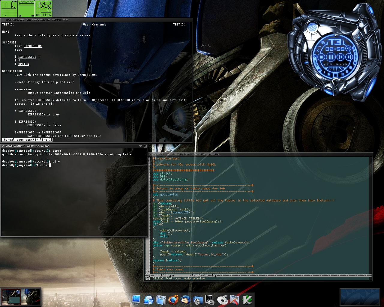
*** Now go fix your code. Tut tut tut!That's the main thing we lost, isn't it? Options. I remember playing with so many different themes back in the day.
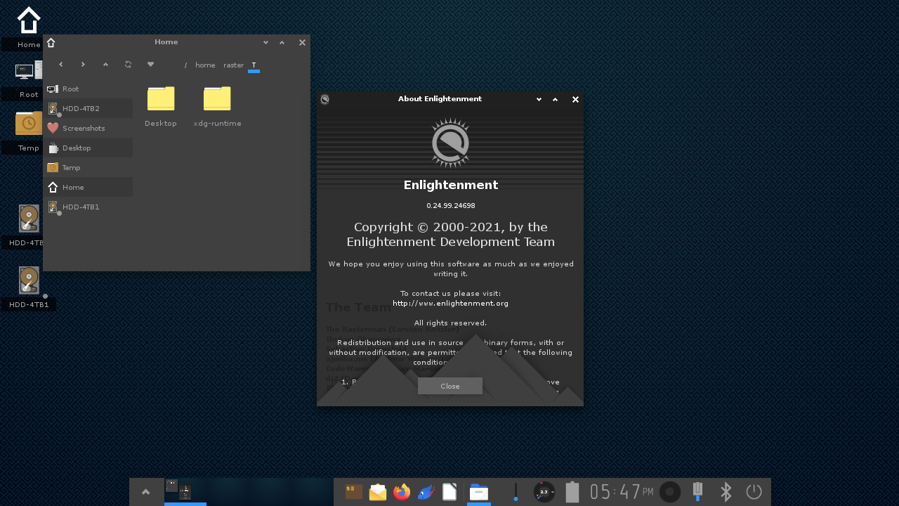
Enlightenment today (https://www.enlightenment.org/_media/aa/shot-2021-12-13_17-4...) looks nowhere nearly as cool as it used to:
https://imgur.com/enlightenment-are-we-posting-throwbacks-de...
http://robert.thegeakes.co.uk/images/elive.jpg
https://commons.wikimedia.org/wiki/File:E17_screenshot.jpg
https://www.reddit.com/r/unixporn/comments/fq4y3c/e17_found_...
Also, the person you replied to mentioned Moksha; that's a fork of Enlightenment 17 (which is what at least two of your cool-looking example screenshots appear to be from).
I was just thinking about this the other week, when I bought an old iPhone, from the skeumorphic era, for nostalgic purposes. I've wanted one for years -- I only had the newer ones that were flat.
I always thought, nah, I'm just seeing thru rose tinted glasses, surely it wasn't that cool, I'm gonna be disappointed...
Well, I finally got one, and oh boy. It's even better than I imagined. There's just so much love and care put into the designs. We really lost something special.
(p.s. if you get a really old iPhone, don't reset the device. It's impossible to activate them now, found out the hard way.)
Biggest thing though, they broke the keyboard. Thought I was losing my mind after years of using a 6, 6S, 12 mini and still mistyping horribly. Then I picked up my iPhone 5 that hadn't been touched in years since ATT banned it, so there's no way I'm used to it... Instantly typed way faster with 0 mistakes. I'm not the only one, there must be some Ba Sing Se type of denial going on at Apple with the keyboard.
If it's so bad, why am I even using it? I'm kinda not. I use my laptop whenever possible now. I call more often than texting on my phone, and on speakerphone instead of earbuds. It didn't get fixed, just had to adapt. And all of this is practicality, not even touching how special the old iPhone felt.
There's easy jailbreak options to bypass the activation for those and have a functional device, nowdays.
It's hardly even skeuomorphism, it's a almost digital twin rendered with Phong.
> The room is ray-traced
imho, part of the charm of iOS6 was that everything was baked into native-resolution textures.