Posted by paddingtone 7 hours ago
https://developer.mozilla.org/en-US/docs/Web/CSS/Reference/V...
I was a theme junkie back in Windows 98 times, but stopped bothering since it became increasingly clear that Microsoft was not really interested in supporting them after XP.
The underlying problem is Chrome exposes no (normal) setting to override the OS level setting at all, not necessarily that the preference shall always follow the browser's theme specifically.
So if the user sets dark mode in the browser, do they not explicitly express their preference for websites? How could they be more explicit about the setting?
[1]https://drafts.csswg.org/mediaqueries-5/#prefers-color-schem...
Chrome already has a setting to change a specific website's color-scheme, although it's only working when Developer Tools is visible (then with Cmd+Shift+P "Toggle CSS media feature prefers-color-scheme"), so CSS implementation actually follows respecting UA-level preference over OS-level setting.
But again, Chrome doesn't have a feature that lets users to choose which color-scheme they want to browse the web (so there is no bug, but it's a UX issue because their Appearance settings doesn't make it clear to the users what this setting changes) other than the setting they gave to developers. Honestly I would love to see all browsers have an option for how color-scheme settings should apply to websites.
However, your original comment was saying that prefers-color-scheme is bugged in Chrome is not true. It works as intended: it follows both UA-level and OS-level settings correctly.
The settings in Appearance tab is not a setting for preference when browsing the web. Many apps have a setting to choose if their app should change appearance when OS setting changed (or to override it), they could simply leave out this setting and let Chrome chrome (app ui) always follow the OS setting or always be in default light mode, instead they gave users to choose "how their Chrome browser will look like", not "how every website they visit should look like".
Safari and Firefox are pretty small.
    - <meta name="color-scheme" content="light dark">

    - :root { color-scheme: light dark }

    - @media (prefers-color-scheme: dark) { }

    - <picture><source media="(prefers-color-scheme: dark)">
Did they not look at the prior art and notice that "one of these things is not like the other?" All the other pieces of this puzzle, conceivably, could have one day had something like `:root { color-scheme: halloween }` or `@media (prefers-color-scheme: supercontrast)` but no, we're just going to cement `light-dark()` as the only two possible color schemes we'd ever want to switch between forever.
Also, prefers-contrast media query exists, which can be used in combination with the luminance modes (color-scheme): halloween-light, halloween-dark, halloween-light-high-contrast, halloween-dark-high-contrast.
I wish Windows would steal this feature for the whole OS: I don't want Notepad to use dark for text, but per-app setting usually turns the whole app light.
But whether it is my os ui or my phone ui, I feel like I can't distinguish borders and boundaries in the UI as well as I can with light mode.
I don’t get the point at all (and don’t want to hear it, I’ve seen the arguments before).
It’s nice it’s there for people who want it but it baffles me it’s constantly treated like the greatest thing ever.
That being that black paper is more expensive than white and that we're stuck with historical precedence?
Reading white text on a black background is much, much easier for me, and the few times I've had the pleasure of doing the same with paper, I still found it to be better. I haven't tried longer texts, since nobody's publishing actual books with black paper, but I'm willing to bet it I'd feel the same about those.
This just reads to me the 'serifs are important because they make reading easier (when reading of paper)', which doesn't reflect my lived experience at all. The only reason these phenomena seem to exist are historical accident and people being used to them.
Because wood is bright and you can’t really print white ink on a black paper?
There might be a usability advantage but using black ink on white paper doesn’t really prove that, that’s just the easier option of the two possible choices.
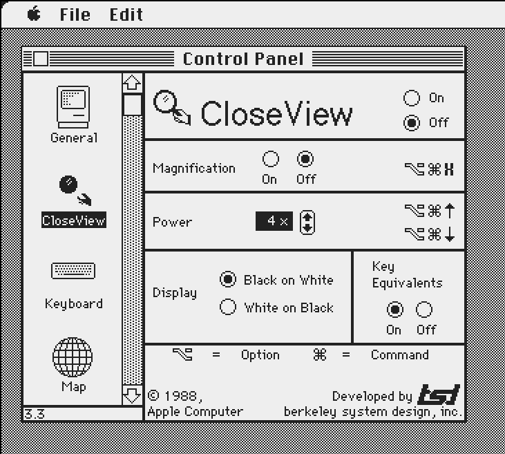
Apple soon started offering a dark mode as an accessibility feature https://kalleboo.com/linked/mac_closeview_control_panel.png
It was not an intended way to use things all the time for a large chunk of the user population.
Not the same.
If/when flat design goes the way of the dodo and light themes are designed sanely once again I’ll pick them back up.
- Dark mode is harder to read when it’s bright out
- Light mode is blindingly bright when I’m in a dark room (and turning the brightness sufficiently low makes everything look washed out.)
My devices change from light mode to dark mode at sunset and it’s basically ideal.
Also it’s nice to just have less artificial light as the sun sets, which makes falling asleep naturally a bit easier.
The preference, either way, is an important accessibility feature.
https://developer.mozilla.org/en-US/docs/Web/CSS/Reference/A...
It's 2026, how does every single website, especially this one, not support this?
I can't personally support light modes in my own software because I can't use/test them, but I'd still add an untested one and fix bug reports about it.
I'm just curious about what people mean when they talk about astigmatism in this context, because the term is usually thrown around without qualifications (plain "astigmatism" as opposed to "irregular astigmatism" or "uncorrectable astigmatism"). So I'm curious about the astigmatism of people for whom dark mode on glowing devices is a problem. Is it typically extremely severe? Is it typically uncorrectable? Is it that people's glasses or contacts are often subtly wrong/outdated? Are many astigmatics not myopic or presbyopic enough to wear glasses all the time anyway? Astigmatism is a broad category and I'm curious about the specific impairments people who avoid dark mode have, in part because I have astigmatism and nonetheless prefer (require, really) dark mode because of other vision problems.
It’d be great if Apple could try this hard in the iOS messages app where there the keyboard is now only dark mode when a background is set.
P.S. the Duck browser literally has a universal dark mode setting, I don't recall a site it wasn't able to dark-force darkify for me (language is fun)
I do appreciate how minimalist hackernews tries to be, but I think respecting the operating system's theme can be considered very minimalist
Javascript: https://pastebin.com/50EUfktL CSS: https://pastebin.com/nzEhxxBY
I'd share my ruleset, however, I am missing one. Before I switched PCs (motherboard caught fire) I had one that made everything dark mode, didn't dim the text, and buttons/text inputs/other inputs were also properly inverted. I had to make it myself because googling Hacker News dark mode always led to the same broken themes. I forgot to back it up. Adding dark mode doesn't need a bunch of extensions, and while I'm sure the "stylus" extension is probably useful (I haven't used it, sounds like a CSS override extension), UBO does CSS and JS.
Just my thoughts. Don't mind me.
I have no idea why all the fucking vibed websites that swank around the web these days are unable to do a simple thing:
  * Have one or more "themes" with dark and light variants
  * Query the browser for a preference of light or dark and offer the default theme with the probed variant.
It's 2026 FFS. Why on earth is this even being discussed as an issue? We have all these cool vibed efforts that can't even be bothered with simple basics.
it now has many dark themes, bloomberg is my favorite.
Where are the themes? (I might be missing on mobile)
The fact that this website wasn’t capable of dark mode made me create a CSS overlay on desktop.
I am back to somewhat normal now with my eyes, but I feel really bad for anyone in the same position.
I know that the current exact HN is magic, but come on. There is CSS to detect the system’s theme. There is no need to create a button or anything.
iOS since 26 has been presenting parts of the system in dark mode despite having the device set to light only. One of the ‘best’ is that launcher groups switch to dark background, but they forgot to switch the text colour, so app names are unreadable. I had hoped iOS 27 would fix it, but no, so I'm switching to Android.
I added dark mode to my blog a while ago and it was a little trying to do properly.
You can implement a half-assed dark mode yourself by adding the following css.
  @media(prefers-color-scheme: dark) {
    body {
      filter: invert();
    }
  }
filter: invert() hue-rotate(180deg)
color-scheme: light dark;
For icons, ideally they’d be SVGs controlled by currentColor, but that may not be feasible or convenient depending on your setup.
Having built websites myself, I know how much attention it takes to make sure every page and component looks good in both light and dark mode.
It's not perfect yet. Even in the second demo, you can see that the chart remains white, creating a stark contrast with the rest of the page. But it's a great step toward making dark mode work across the web without requiring every developer to implement it themselves.