Like, I'm not even an artist, so I'm sure there's a million things I'm missing, but it's just so upsetting to look at. There's weird random reflections on things that shouldn't have reflections, the coloured light absolutely doesn't actually track through the stained glass onto any surface that makes any sense, light is coming from every which way, it's just... gross to look at for anything more than a quarter of a second.
And this is what they're using to hype people up for it. /shrug
Trace any light ray through the scene, and you will see they are bending in ways that light does not.
I'm sure we could teach a world model about light, but this image model fundamentally does not understand how light behaves (which is one of the primary things an artist needs to understand).
Based on current trends I would not be at all surprised if LLMs working with tools, SVGs and looking at their own work get there before diffusion models. I've stopped keeping up with the image models so maybe I'm underestimating the progress but I dropped out because they were so frustratingly bad at composition and integrating details together.
That whale image makes me think that the situation hasn't improved as much as I'd expected. It is a really cool idea and a pretty picture, but the whale looks a lot like it is flying over the top of some sort of huge glass dome on the ground.
> Please respond to the strongest plausible interpretation of what someone says, not a weaker one that's easier to criticize. Assume good faith.
> Eschew flamebait. Avoid generic tangents. Omit internet tropes.
Long before generative AI, unpleasant nerds would poop on fun images by claiming they could "just tell" that they were altered in photoshop. Today I'm seeing a complaint that the path tracing from the multi-layered stained glass into the cloud simulation is not as accurate as a human would have painted by hand. And, that apparently makes us grumpy.
There have been unending examples of people liking an image until informed it was made by AI. Then, suddenly they see all sorts of fine-detail excuses to dislike it. And, of people calling out "obviously AI" problems in the works of human master artists when someone lies and tells them it was generated.
I'm not seeing any difference in the discussion here. The whale is a bit overly high-frequency. The owl is fine. The guy at the computer would be considered great if a human made it. The travel ad is bland. The balloon letters are fine.
None of these are "terrible eye sores". Some people don't like AI generated imagery as a process. Seeing generated images make them feel upset. That's reasonable. But, claiming these images in isolation are objectively awful regardless of their source is reactionary. If any of them were made by a person using Photoshop and/or Blender, they would be received with a resounding "Meh" or better.
When you forgo process the odds that you'll make good art drop to 0. Tool use is a much better path forward for self driving, artistic computer than big data. Images 2.6 only has use as a tool.
SVG support is interesting but I suspect shenanigans are afoot since that's not how image generation models work, and it would likely strip any SynthID watermarks. It's possible OpenAI has pipelined a raster-to-vector tool that does the conversion automatically. (I developed a similar pipeline and it works extremely well; I'll open source it at some point)
EDIT: Per documentation, there is an explicit `output_format: "svg"`, and I am indeed correct there is raster-to-vector in play:
> The API creates a reference image and uses it to produce the SVG. The quality setting controls that reference image. Decode data[0].b64_json as base64 and save the resulting UTF-8 XML bytes with a .svg extension.
OpenAI claims 50% faster generation with Images 2.6 but curiously price is the same as Image 2.5.
I couldn't find this requirement in the documentation, but if you don't pass one in, you get this error:
  400 {"message": "SVG generation requires 'svg.model'.",
     "param": "svg.model", "code": "missing_required_parameter"}
Recraft is probably the only group I know of that had a native text-to-SVG generator pretty early on, but since it’s a closed model, I’m not familiar with what they were doing under the hood technically.
Coding related have had massive step-up improvements over time.
The same cannot be said for image generation. If anything, I swear it's gone backwards.
It peaked with very early midjourney (like 2022), maybe follow ups with stable diffusion, and then with some of the nano banana models for actual editing. But overall, very lackluster in comparison to other areas.
With images, I don't see such potential. A builder and a reviewer iterating on improvements? Maybe the reviewer noticing it just needs programmable improvements, eg contrast, color balance etc and triggering a script on top of the LLM generation?
And this summer we got Ideogram V4 and Krea2, both of which are highly capable. You can see how the open/closed models have advanced since SDXL in the Progress tab.
https://genai-showdown.specr.net
MJ is pretty out-of-date by this point though it can still be fun from an image space exploration perspective. It scored a rather pitiful 2 out of 15 on my bench back in the summer of 2025.
Otherwise you’re implying the quality plateaued 4 years ago which is ludicrous.
I'd bet the future is in combined AI-driven 3D modelling + rendering + AI post-processing. This pipeline solves quite a bit of typical image generation problems.
I would argue both are exactly the same. The images are getting nicer, the AI can alter pictures better. It's the same as coding.
The difference is our perception. Looking at image takes 2s, and we can spot what we don't like. Looking at a code change takes hours to understand. It's very difficult to tell how much code generation is improving because almost nobody is reading it.
Image and code generation don't correlate exactly, but I would be surprised to see a big jump of capabilities in either without the other quickly following.
(Right now missing some models which I‘ll add today.)
Investment in new models follows the money.
In reality RE has only gotten better because they RLd it into the models because they NEED data, so now every kid is decomping proprietary softwate and sending them back great training data.
It absolutely has not. You do have a nice point with data though, somehow haven't thought about that
Opus 5.5 begs to differ
Not everything runs in a browser, it still creates fires in codebases and generally produces spaghetti code. It gets the job done for 50th percentile problems for sure.
Turns out not everything is a 50th percentile problem.
I guess I should have been careful about “half”?
These models have a hard time imagining men with naturally blond hair getting grey.
That said, I gave it one of my more difficult image prompts and the model now surprisingly passes (without plagiaristic cheating): https://chatgpt.com/share/6aebcbcd-6b8c-83e8-b52b-dbedf20ce4...
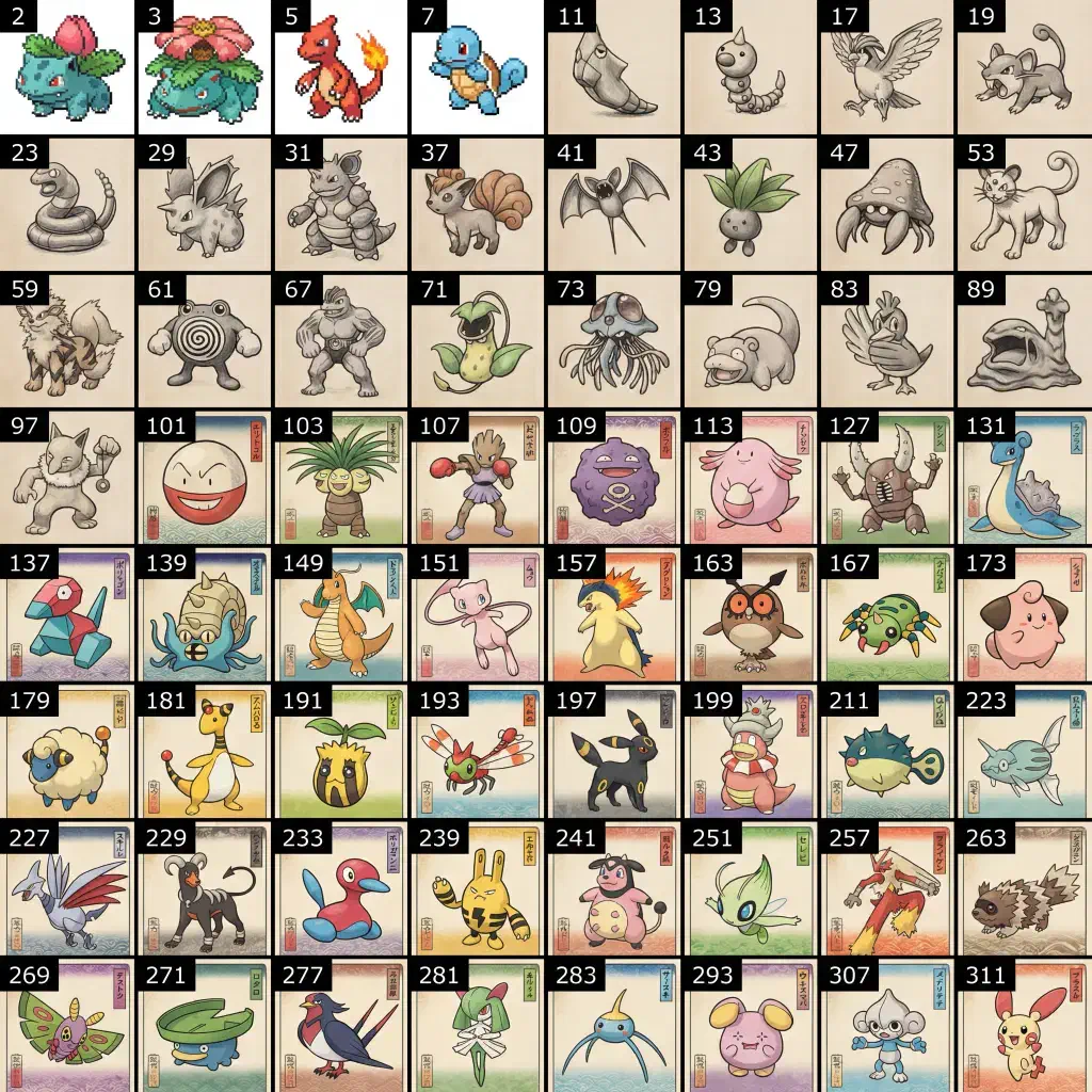
That being said, the ukiyo-e artwork looks more like a standard colored pencil illustration, and it sort of tried to cheat by adding some vaguely Japanese natural scenery.
See this Kickstarter all the way back in 2013 for a great example of what Pokémon might actually look like as ukiyo-e woodblock prints.
https://www.kickstarter.com/projects/1499165518/ukiyo-e-hero...
https://ricedigital.co.uk/this-japanese-ukiyo-e-pokemon-art-...
When I did a similar prompt with ChatGPT 2.0 it was worse, so interesting to see improvement.
It is different from earlier image models which just use a simple text encoder and struggle with conditional logic if not explicitly trained for it.
> * Mapped Pokémon primes > * Organized the grid
before generating the image.
So really it is first figuring out the exact specification of the layout, then prompting the image generation tool with this specification - perhaps unless you do it with an "instant" model.
This to me as if someone is complaining for a basket full of extremely thin sliced fried potatoes for an order of "chips", rather than like wood and metalworking scraps.
https://chatgpt.com/share/6aec2ba7-6edc-83ea-9a48-b41b53874a...
Would you appreciate more if their model generated cats with 5 legs in 99% of cases, and they cherry picked that 1 in 100 image where it has 4 legs? Do you think doing that would make them more caring and professional?
Not like this is the fault of the AI progress, we could use AI to go beyond the quality what we used to deliver, too. It's just the pace expectations that are now "in the room" ?
We've seen this play out over and over again, in many different sectors. The whole shtick of the old (Bellhead) telecom world was quality at the (literal) expense of price, which didn't work out well for them. Same for CD versus pirated mp3s, DVD versus pirated videos (and, to a lesser extend, theaters versus bootleg cam releases), native texting / GSM calls versus WhatsApp and similar, mainstream newspapers and media versus blogging and social media, traditional electrical appliances versus Chinese-made, and so on.
Because of the innovator's dilemma, In many cases, the cheaper, lower-quality product later surpasses the quality of its more expensive counterpart.
AI is just one more example of this happening. It lets you make more things which otherwise would be far too expensive to make, even if that often means a lower quality product.
With that being said, my understanding of that issue is a few years old, people have always said CFG is a havk until models get better at following prompts on their own. So thee “look” that tools like Nano Banana ends up with could be something else. It may or may not be a necessary artifact of some part of the process.
It is entirely possible to prompt engineer away from that style, but that requires effort and knowledge that said average person does not have, so it's stuck in a feedback loop.
The problem is in the rewards, but it's more how they average across domains and contexts, so AI misapplies them. Actually, in human preference evaluations, most of Gen Z in particular extremely adverse to the common look of AI images.
So it's not the annotators involved in RLHF, it's the models failing to map to human preferences at the task level. The failure rate is also uneven across domains.
Where there are challenges with human annotation, it's not the ability to gauge what's good but rather how to correct what's wrong. Most people can tell when something is off but struggle to articulate why. That's where more domain expertise is required.
For posterity, the memetic ugly food can be controlled and mostly filtered out with prompt engineering. Here's a quick ad hoc test example which (hopefully) uses the new model: https://chatgpt.com/share/6aebf030-9d38-83e8-a103-3509883905...
First image is fine, but attempts to make it more wacky turn it to the AI food slop. So then followup prompts deslopify it, mostly successfully.
I think the way they'll solve it in the end is to create an ultra-high-fidelity simulation of the world including modelling taste and other senses on the level of physics, and then incorporate all of this into the training rewards.
I think this is how the machines know what tasty wheat tasted like.
This kind of content is here to stay and we’re going to see more and more of it. Unfortunately…
I see restaurants post AI flyers and ads to random local Facebook groups and most of the replies are about them being AI slop. I think it’s an uncanny valley problem: People don’t mind if you post a real photo of your food or a cartoon drawing of a pizza or a pig on a spit, but when it’s a weird fake photo with texture issues, it looks gross, especially when it’s food.
I think a lot of people who open restaurants probably aren’t extremely online, partly because it would be physically impossible with the amount of work they have to do, but they definitely pay attention -sometimes too much attention — to public online feedback.
I absolutely do not get the uncanny-valley images. Those all look gross. Besides not actually being representative of the dish, the images have all sorts of weird texture issues, look too glossy, and are just unappetizing. I cannot understand why a restaurant owner would want to put up an ad that has food that looks straight up gross.
I've been seeing "AI slop" stickers posted on things
> I see just everywhere including food menus
The places I have seen it in use are the places that would have a handwritten scribble that was misspelt and would be something mocked by people because it was written by ESOL (or vice versa, English speakers trying, but failing, to write in a different language)
Honestly, I think the AI slop is a step up - I can read the signs clearly, and they are only mildly offensive
Edit: I guess I take the view that - like a pirated movie filmed in a cinema - the only people that use/watch it are people that were never going to pay for the real thing anyway
Generative AI (coding, images, etc.) has only accelerated the atrophy of basic observational skills.
> They absolutely have not taste. And I don't mean that in a small way. I mean that in a big way.
applies here.
People just hate AI and will find a post hoc justification for their hatred in every situation. The link you gave could have just as easily been someone expressing surprise and delight at the artists choice to not follow traditional physics... but instead be playful in unconstrained ways. Shrug.
the vast majority of people have no idea what they are doing, going on vibes and copying the opinions of their peers
Do you have a link to the numbers that clearly show this?
I suspect people are somewhat hypnotized by the content, in the same way a toddler is hypnotized by Cocomelon. Something about it is enthralling and keeps the attention. I wonder if it's related to the phone game icon / YouTube thumbnail phenomenon of "person's face making an extreme expression with the mouth open." AI generated videos for example still tend to have very exaggerated facial expressions and the mouth is always unusually wide when talking. I also wonder if something about the uncanny smoothness of movement (I assume caused by any form of transition defaulting to "linear") has a hypnotic effect.
I'm not sure how to look into this further. Elsagate is an interesting past example, and what I've learned so far I threw in a blog post a couple months back https://blog.calebjay.com/posts/psychic-attack/
Right now I'm looking into "Lula's army" and the AI generated content they used. I feel like there's something significant and perhaps even dangerous that could be developed bere.
2.5 low, 196 tokens, $0.006
2.6 low, 823 tokens, $0.025
2.5 med, 439 tokens, $0.013
2.6 med, 1449 tokens, $0.043
Interestingly, higher quality settings show no change in token usage between the models.
  Setting (1024x1024)   Tokens   Cost/image   Time
  2.5 medium              439     $0.014     12.0 s
  2.6 low                 824     $0.025      6.7 s
  2.6 medium            1,449     $0.044      7.9 s
2.6 high 1,758 $0.053 8.9 sOutput image tokens per image (2.5 Flare → 2.6 Flare / Sunburst)
low, 1024x1024: 196 → 824 (4.2x) medium, 1024x1024: 439 → 1,449 (3.3x) low, 1024x1536: 158 → 664 (4.2x) medium, 1024x1536: 343 → 1,132 (3.3x)
Same $30/1M output tokens on all three, so per image: low: $0.006 → $0.025 medium: $0.013 → $0.043
from 200 to 450 is just a little over 2.
Nothing near "quadrupling"
439 tokens with 2.5 to 1449 tokens with 2.6 is 3.3 times.
I didn't have high expectations, and I still think you can probably get better results by doing a First-Last-Frame using something like Minimax H3 but I was still rather surprised that it could do it at all.
Here are some of the results. The last one shows its ability to take an existing image and convert it into an animated GIF. It's a picture of my husky inside a snow globe.
Honestly, you have to think about the use case. GIFs are going to be little throwaway things that you're pasting into Discord or meme-ing.
Nobody's reaching for a GIF if they're looking for professional results.
It's a shame that the SVG output seems to be limited to static vector graphics only though - or rather I couldn't get it to produce anything with the <animate> attribute.
If you actually want something that looks decent, it feels like tool use would at least help cover the obvious blunders. Building layers to composite would go a long way to removing some slop here.
Ain’t wrong buuuuut…