Posted by adunk 5 hours ago
Subsequent ones were designed by UI designers, and opinionated senior managers, who already knew how to use them, and took out usability features to make them "look nicer". This sort of worked when the opinionated manager was Steve Jobs. Most managers are not Steve Jobs.
> in some applications they seem to have taken extra steps to make it difficult to find the line to grab
Pet peeve of mine in Windows where the line is at most one pixel now. They also took away the coloured distinction between title bars for the active window, so you don't know where keystrokes are going to go.
At first glance it looks like this is much more breadth over depth. Quite an array of systems here.
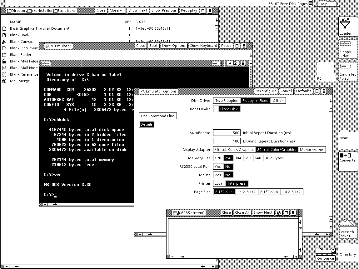
GEM + Ventura Publisher http://www.typewritten.org/Media/Images/ventura-publisher-1....
Viewpoint http://www.typewritten.org/Media/Images/6085-viewpoint-2.0-p...
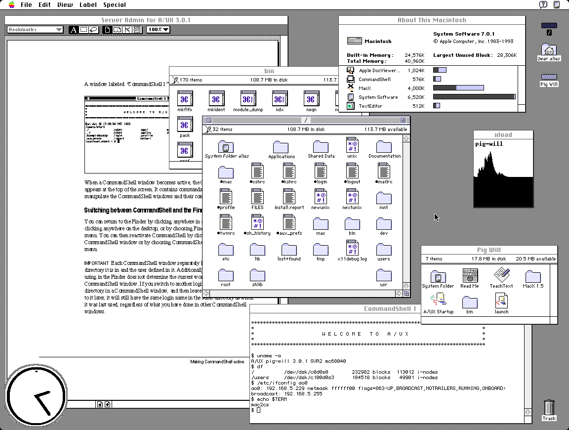
AUX http://www.typewritten.org/Media/Images/aux-3.0.1.png
It's suprising at first look that GEM tops my preferences but I recall having a very fond time on the Atari ST 520+. It had one of the best b/w monitors and TOS+GEM was orderly and uncluttered.
Only preemptive multitasking and per-window menus were missing. As a plus, the OS was in ROM, so boot times were <1s.
gsettings set org.gnome.desktop.interface overlay-scrolling false
https://en.wikipedia.org/wiki/GEOS_(8-bit_operating_system) https://en.wikipedia.org/wiki/Berkeley_Softworks
For the people that didn’t live through this time, lining these images up makes it obvious why those that did speak of how visually impressive the Amiga was.
Except missing that sock and falling down into the dog's path and understanding the concept of fighting like cats and dogs.
I just found out that the theme song is on Wikipedia.
It's one of my favourite things, looking at and analyzing older interfaces. Some are lovely, some are cute, some are ugly, but most are... "naïve"? I love to think about the effort, the research, the trials and tribulations. I feel I will spend a great deal of time in this page!
First and foremost to me those screenshots are somewhat disappointing as they can't match my memories. NeXT, BeOS, Irix, OpenLook, SunOS, Arthur (imagine the diversity)... they were SO awesomely impressive at insanely high multi-sync CRT resolution.
Reality simply can't match the mind's eye, at least not for me.